
Work created at Frontier
SUPERGRAPHIC
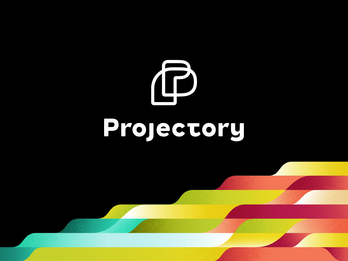
This narratively rich brand graphic tells the story of multiple splitting pathways leading towards many potential futures. It’s a visual expression of Projectory’s mission to facilitate these important conversations during in-person events. As a supergraphic, it can be cropped, scaled, and recoloured for use on event signage, branded collateral, and presentation decks.

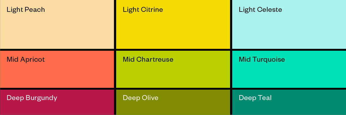
Colour Palette
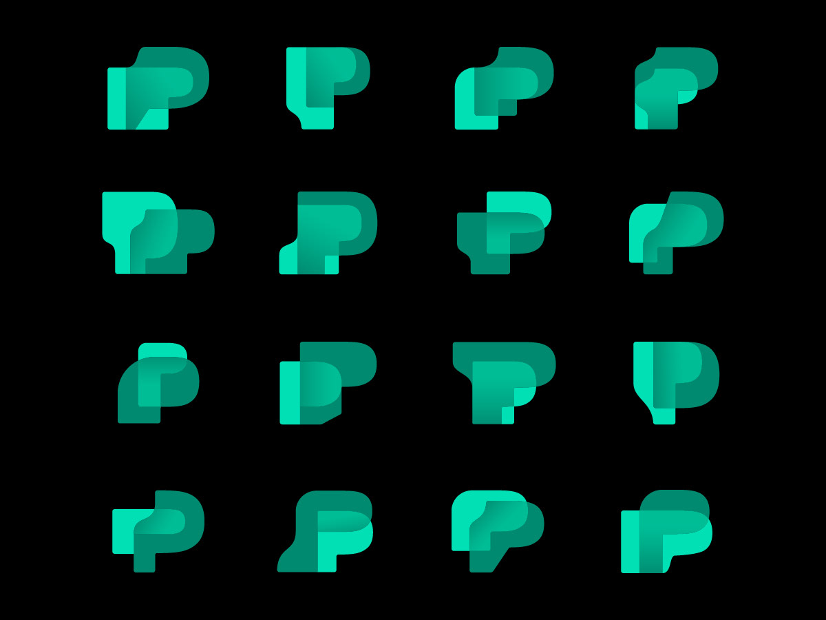
Monogram Series
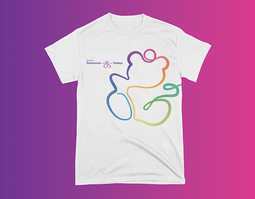
T-Shirt
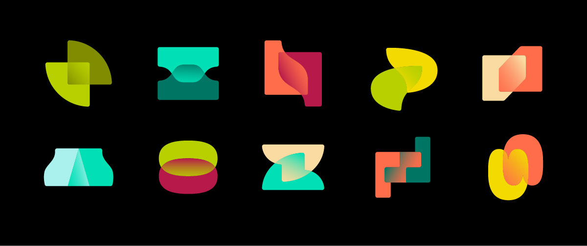
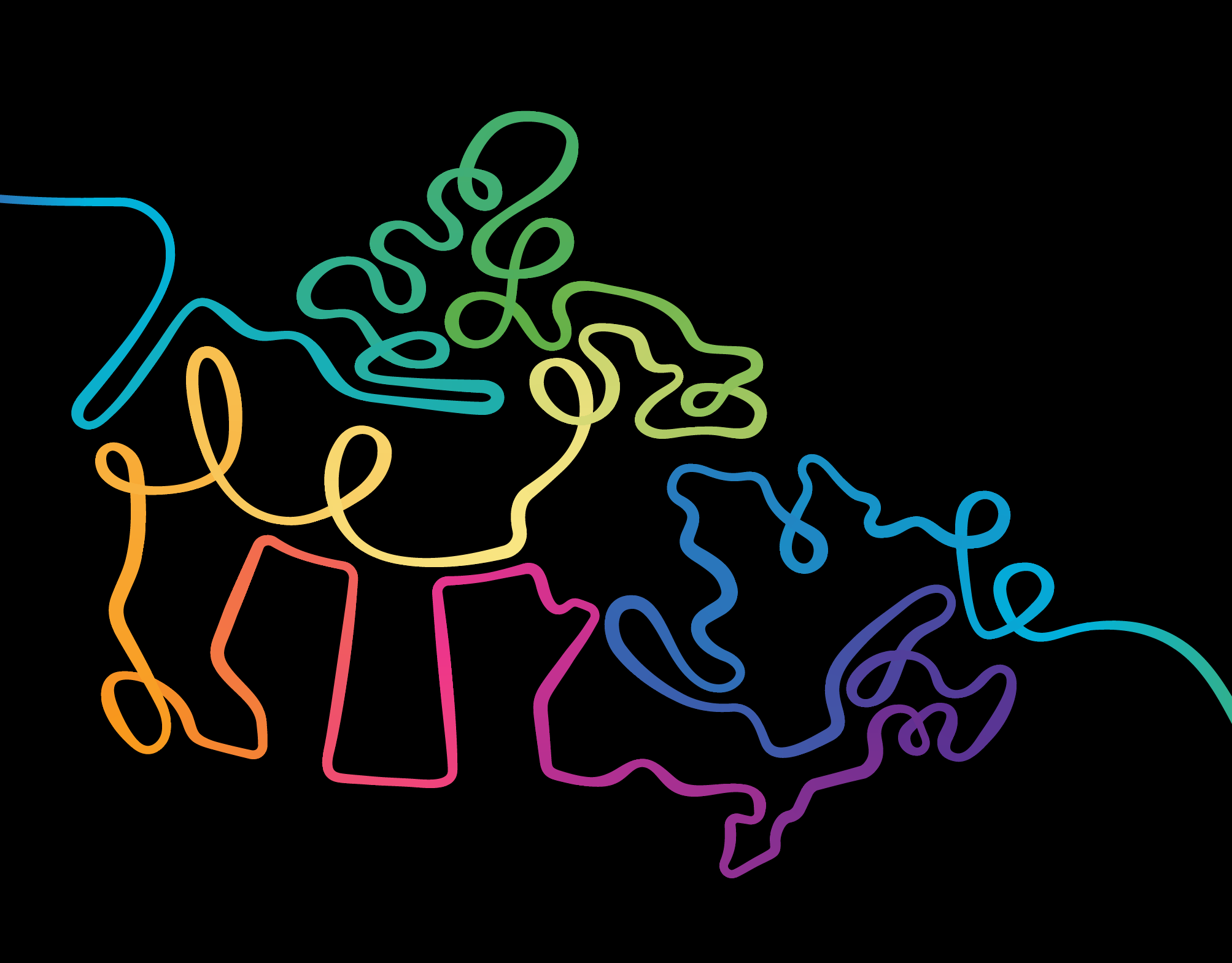
Abstract Shape Library
Notebook
BRAND ILLUSTRATIONS
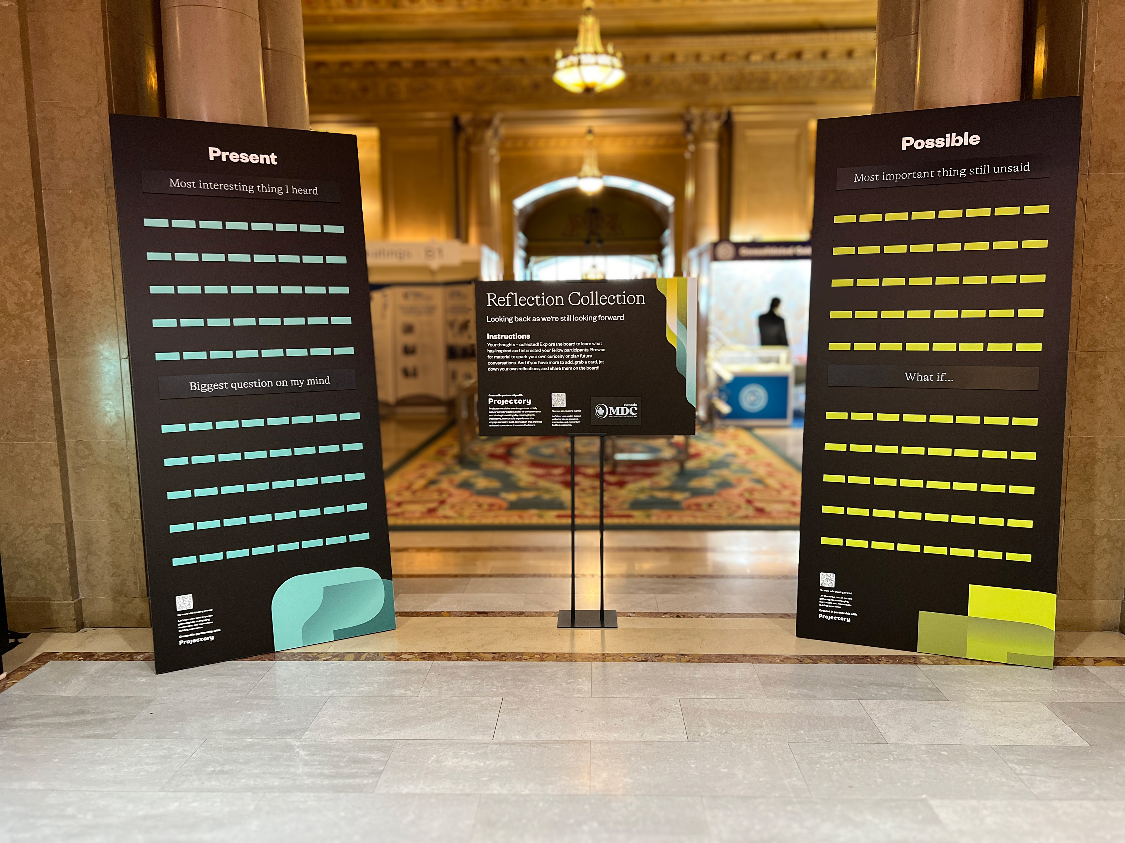
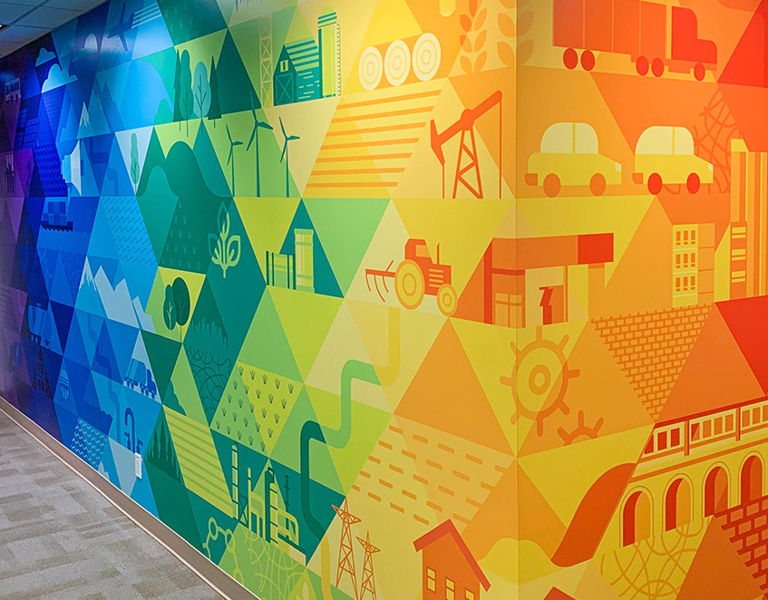
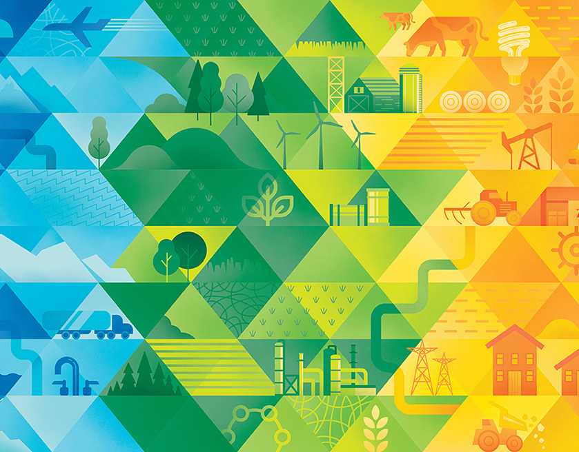
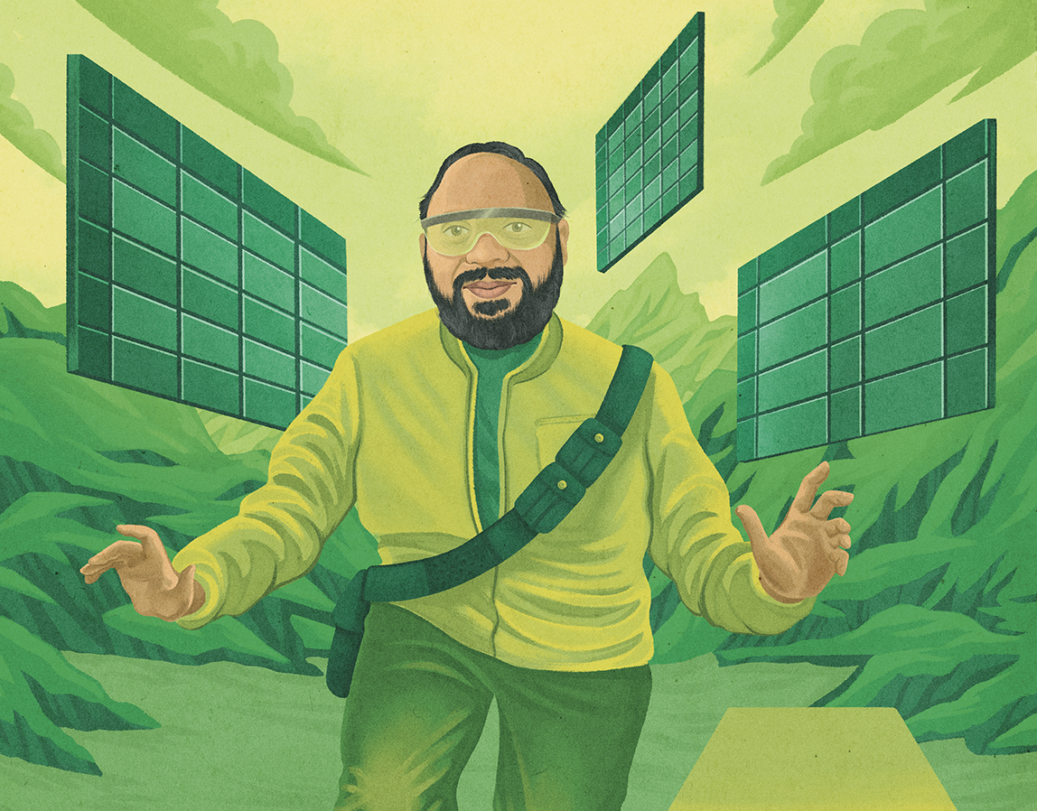
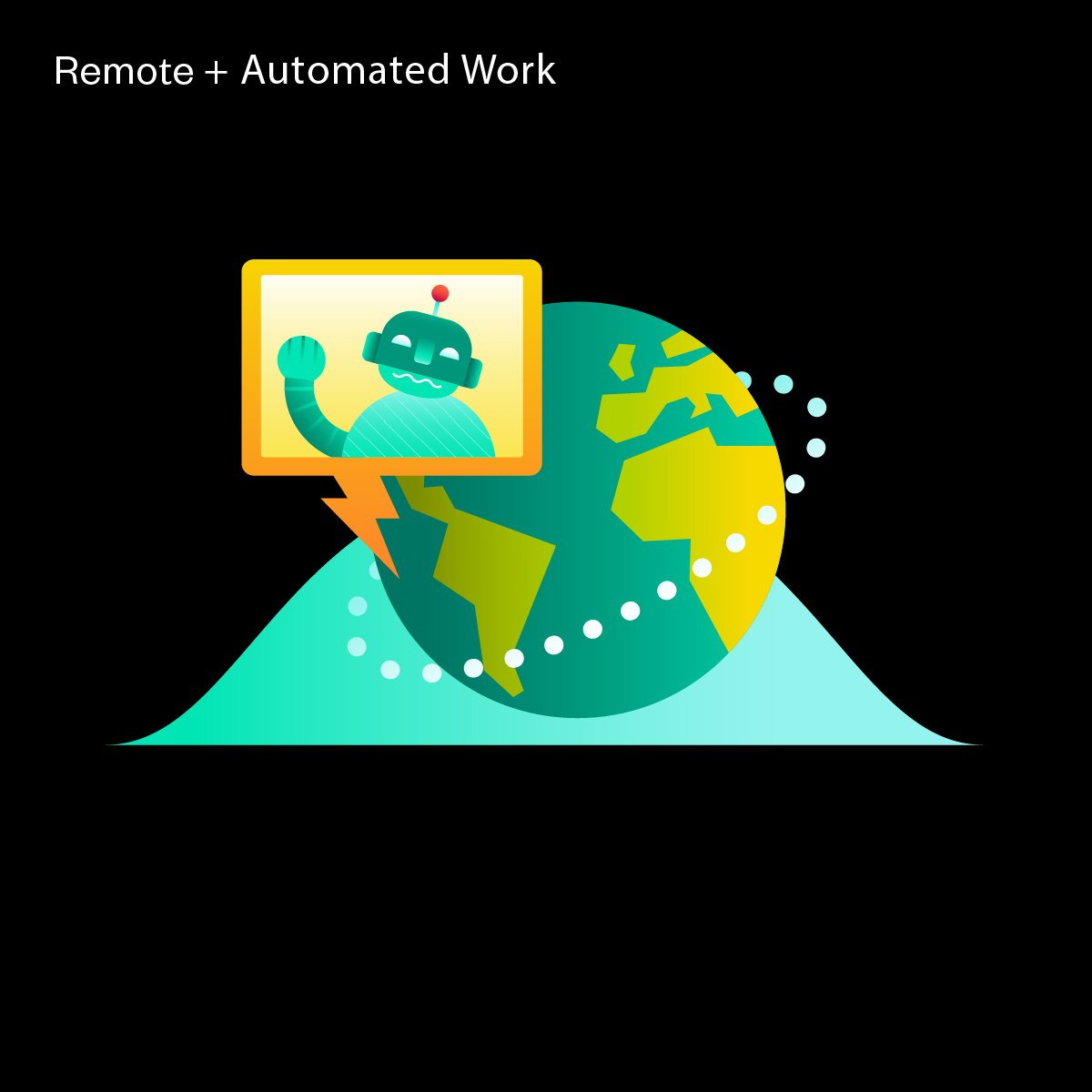
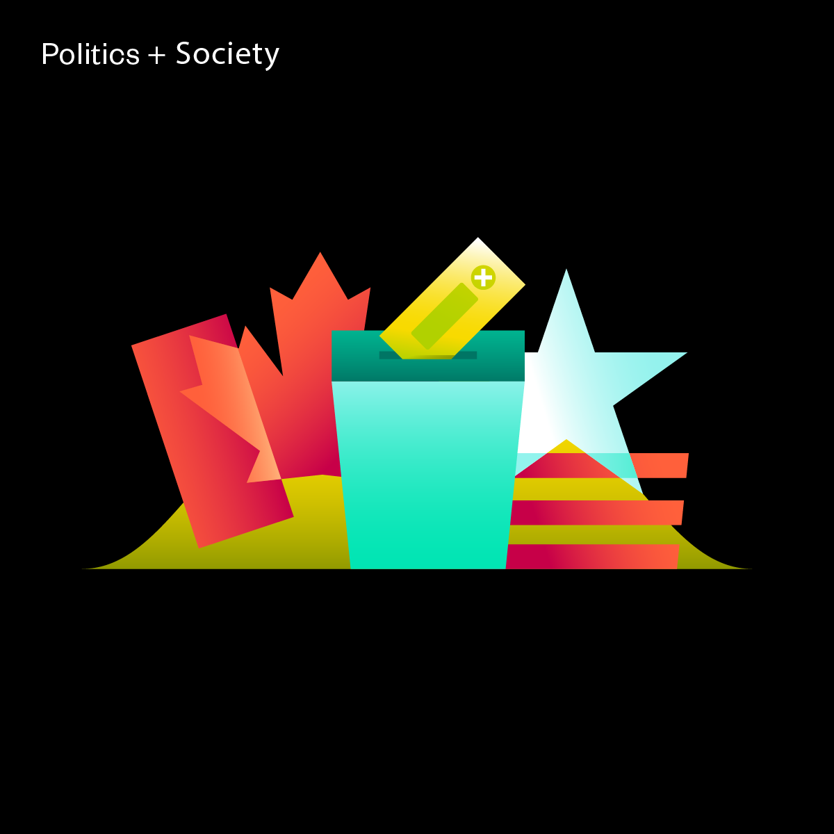
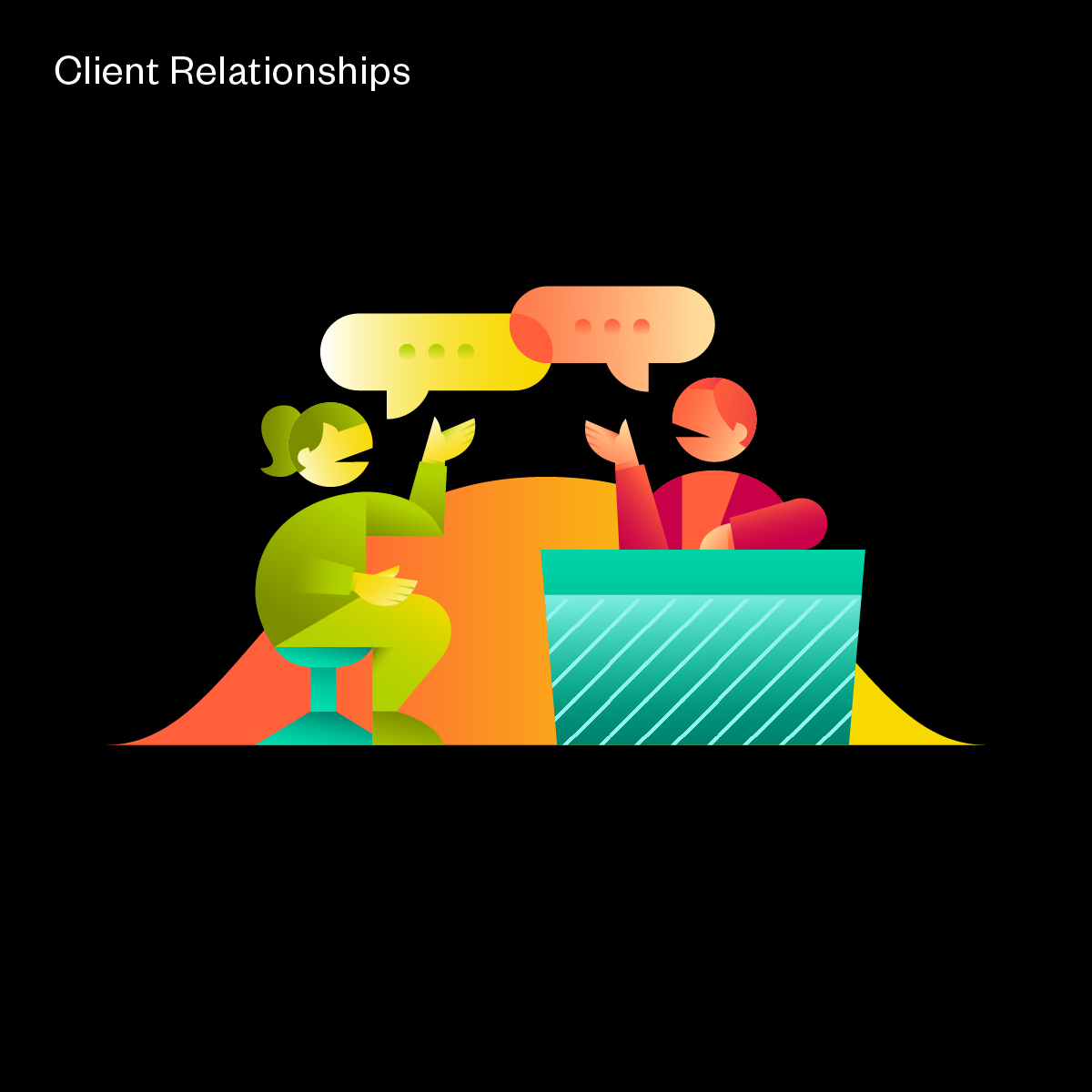
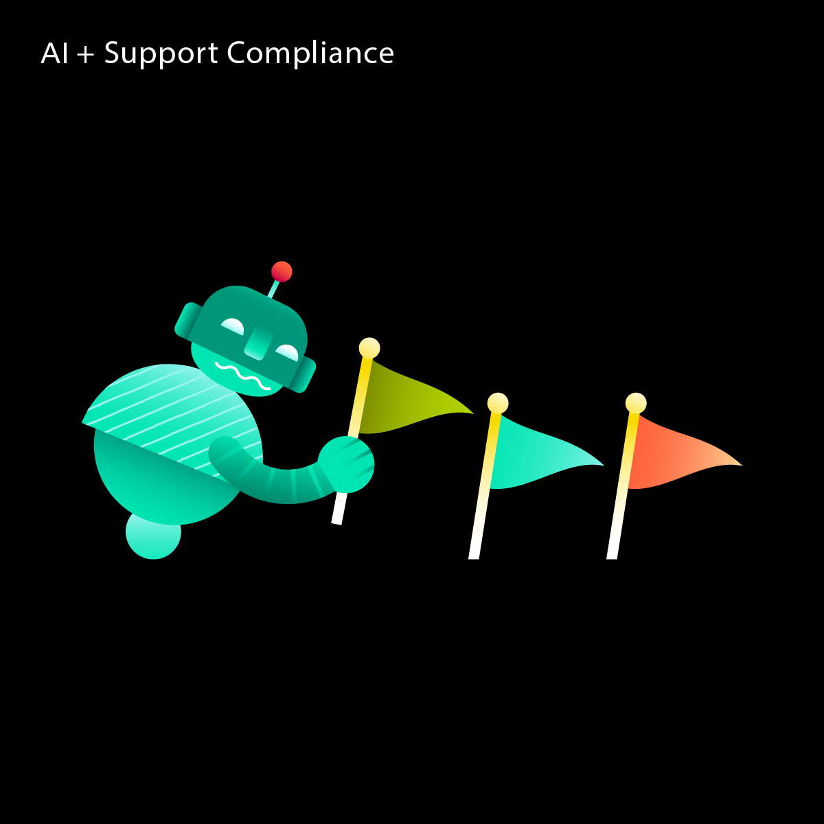
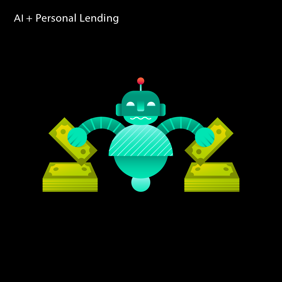
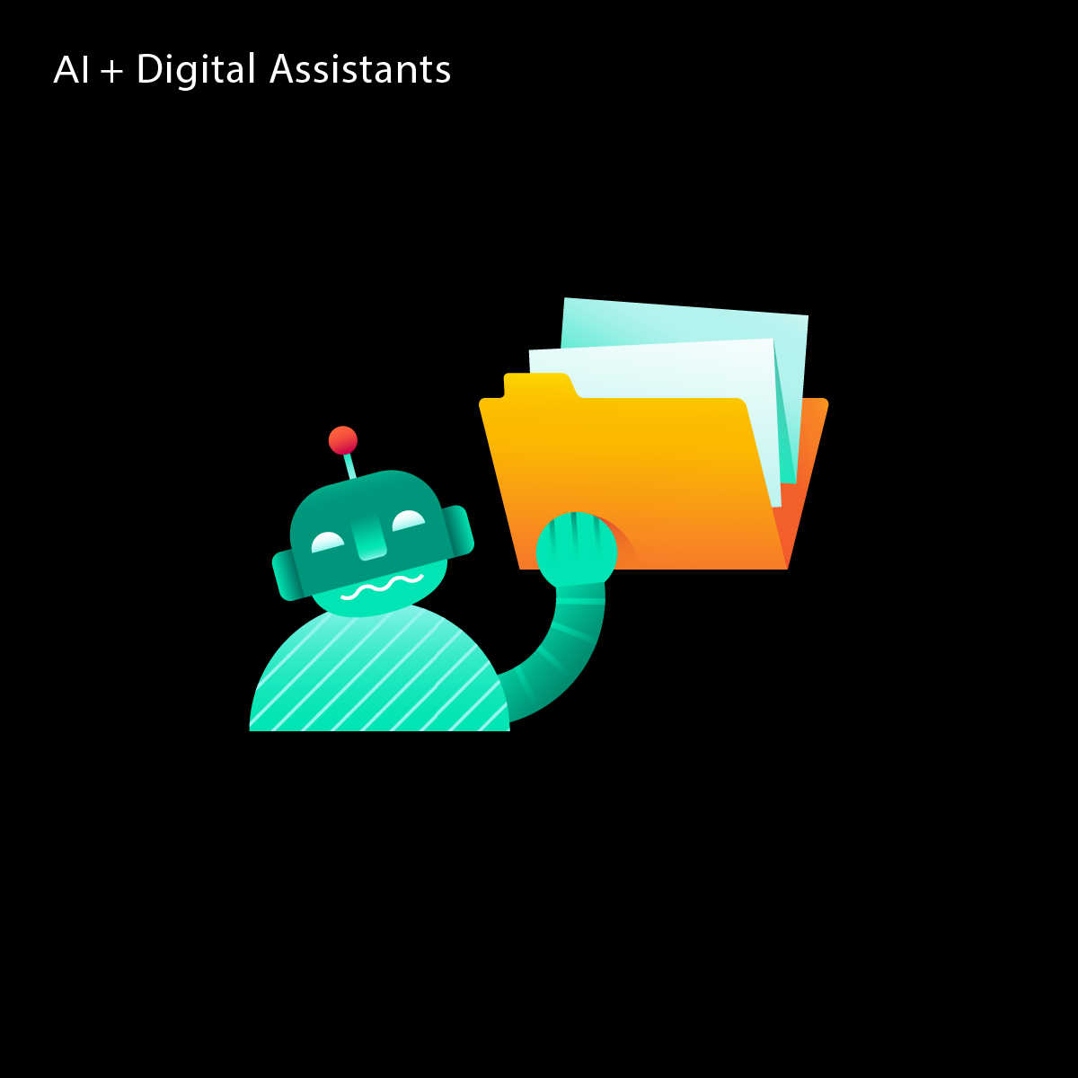
Building upon the visual identity for Projectory, an illustration language emerged. This initial series of spot illustrations were developed to accompany a post-event synthesis digital experience for one of the clients of Projectory. The illustrations were informed by the many thoughts, ideas, fears, and motivations of event attendees, expressed through interactive in-person activations. By culling through hundreds of responses, key insights were pulled out and these supporting visuals help to tell that story.
The colours pull from the existing brand palette and the overlapping and converging formal expressions are continued. This time, not just for abstract visuals, but for narratively rich vignettes.
The colours pull from the existing brand palette and the overlapping and converging formal expressions are continued. This time, not just for abstract visuals, but for narratively rich vignettes.


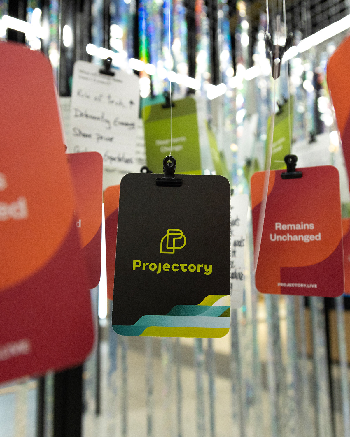
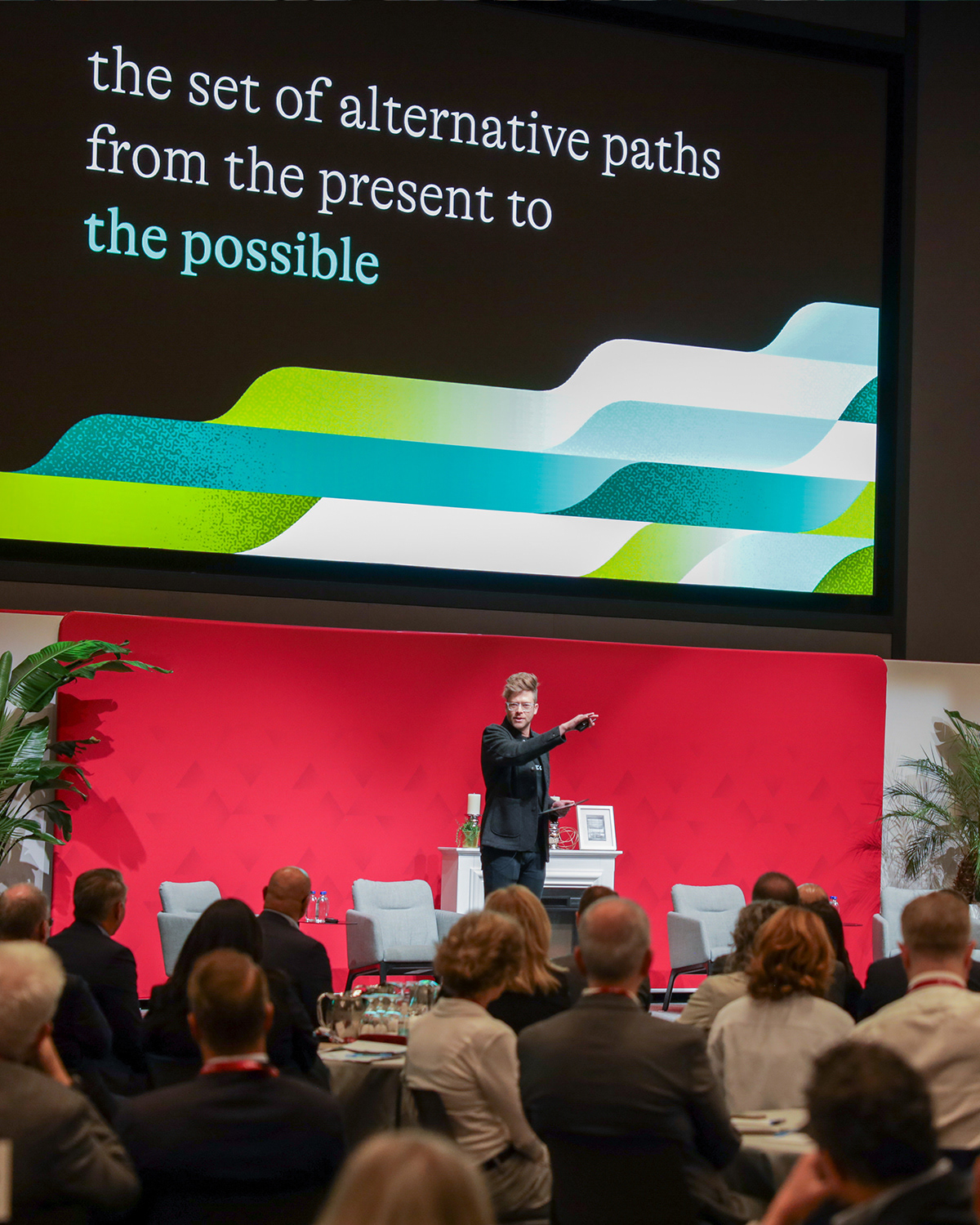
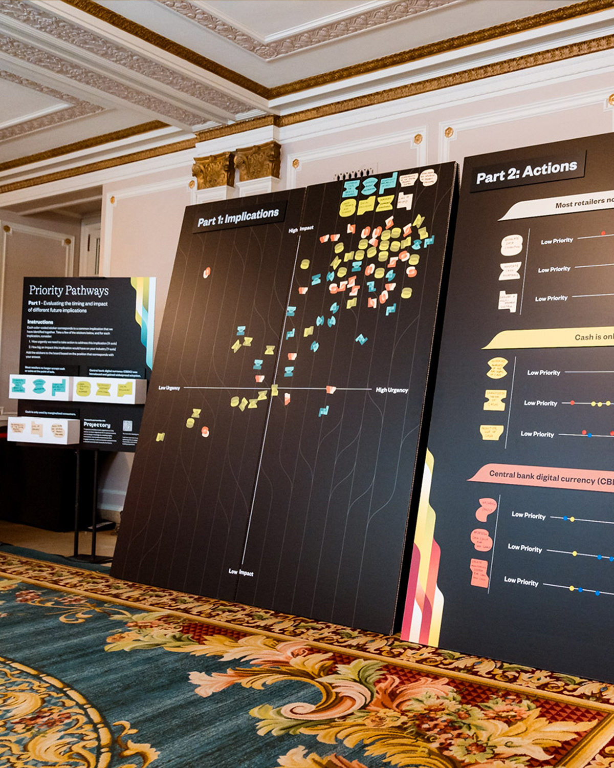
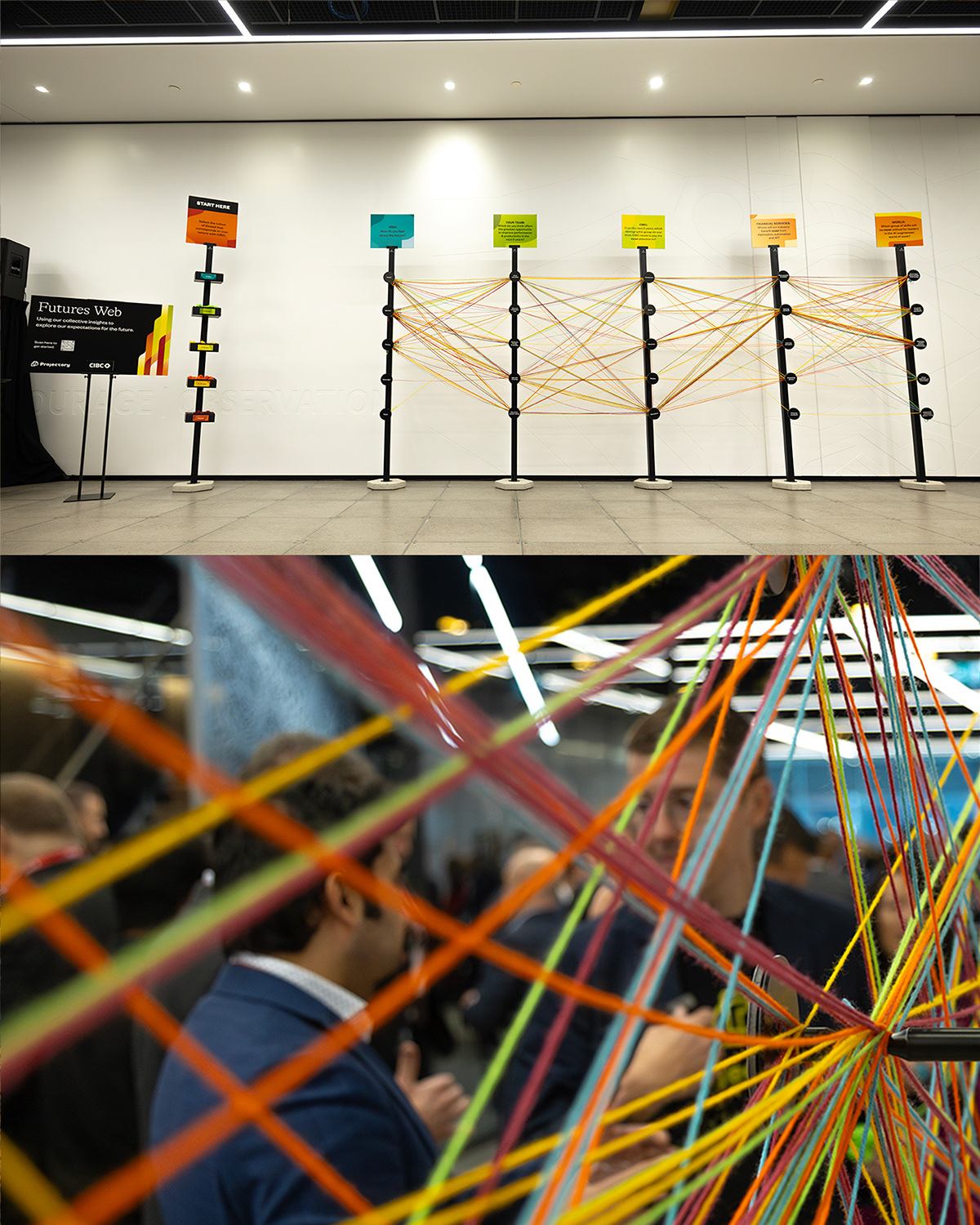
IN-PERSON EXPERIENCES
This event-based brand really came together in the in-person experiences that were designed using the brand assets. The super graphic, monogram alternatives, and abstract shape library became a library of tools to brand signage, interactive cards, and participatory experiences. Enlarged for backgrounds and slides, printed as stickers and labels, and of course team t-shirts.