From Alessandro Michele’s Gucci, to the trends of eclecticism in interior decorating, maximalism is experiencing a renaissance in our visual culture. But what does maximalism mean for the graphic designer whose formal education has often favoured modernism and a ‘less is more’ approach? Maximalism is often described with negative connotations (excessive, showy, or overly complicated), however, I would argue that the work produced with this mindset can be described much more positively. Maximalism in graphic design is immersive, culturally vibrant, and fantastical. By looking at the past century, I want to highlight 5 different expressions of maximalism in graphic design in order to assert its advantages.
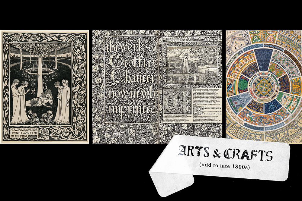
Arts & Crafts (mid to late 1800s)
The reformation of Victorian industrialization by designers like William Morris and Aubrey Beardsley embraced the concepts of ‘decorative honesty’ and gesamtkunstwerk (total work of art). This movement is an example of modern maximalism by its embracing of ornamentation and the beauty of intricate motifs and typography. Work created under this Arts & Crafts umbrella referenced Gothic manuscript illumination through the embellishment surrounding printed text. These ornamentations serve to increase our imagination of the story being told, whether that be a lush fairytale or an ecclesiastical epic. Owen Jones’s book, Grammar of Ornament (first published in 1856), became the guidebook to creating these richly detailed designs by collecting an archive of historical motifs from the Egyptians, Turks, and Celts, to name a few.
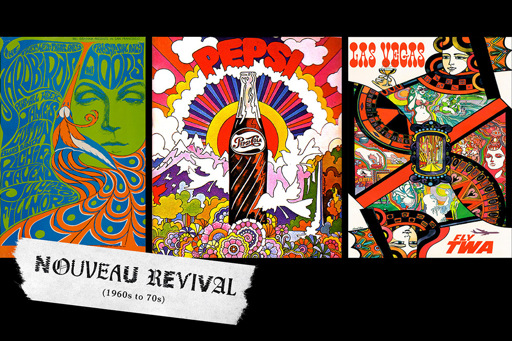
Nouveau Revival (1960s to 70s)
Jumping forward several decades, the psychedelic imagery of the 60s and 70s finds its place in this maximalist repository by providing another revival of ornament not seen in the classical modernism of the 40s and 50s. Illustrations and typography are wholly integrated together in complex expressions. This style takes the historical reference of Art Nouveau (late 1800s) one step further by dousing the sinuous forms in psychedelic colours that pierce the senses. One maximalist concept, horror vacui, Greek for ‘fear of the empty’, is a key element here. Every inch of space is filled on posters, record covers, and packaging. These examples of all-consuming layouts are rich with illustrative details similar to the prevailing art movement of Neo-Expressionism. This take on maximalism was embraced by brands and advertisers looking for a way to tap into the ‘hippie’ youth culture of the time.
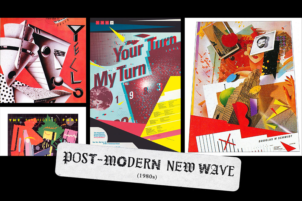
Post-Modern New Wave (1980s)
Post-Modern design houses various substyles designers from the 1980s were working with, including the American new wave. These expressions operate beyond the orthodox purity of the Bauhaus and incorporate maximalist sensibilities. While works might be composed of simple geometric shapes, the final output is far from minimal. These works were kinetic, traveling the eye across the page in a careful dance of delightful play and experimental communication. There is an anti-design aspect to this work which takes the structure of a grid, bends it, distorts it, and crumples it up on the page. Dan Friedman, an educator of post-modern design, wrote about this balance between legibility and readability. Legibility is the effect of simple clear communication and readability is the quality that promotes an interest in actually reading the material being communicated. Readability can be enhanced by using unconventional aesthetic configurations to treat the typography.
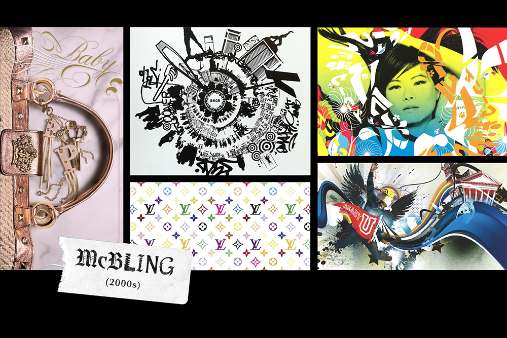
McBling (2000s)
For the first decade of the new millennia, we see a shift away from the more prevailing Y2K futuristic minimalism of the late 90s. Post 9/11, we observe a flourish of extravagant posturing within the larger design world. Music and fashion influenced the visual style of this era as well the overwhelming interest in celebrities. Takashi Murakami described maximalism as ‘submerging [himself] in a surrealist world’, something we see evidenced in his famous collaboration with Louis Vuitton. Gothic and script typefaces, sparkly embellishments, and bursting vector expressions of colour and pattern are hallmarks of the McBling style. We might find elements of this era in maximalism as kitschy with its loud expressions of ‘luxury’, but we are also beginning to notice aspects of the style begin to reemerge with hyperpop.
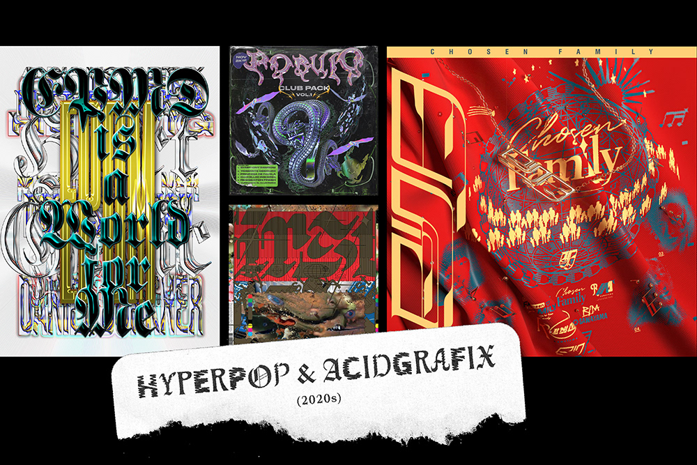
Hyperpop & Acidgrafix (2020s)
The rise of the hyperpop music genre has influenced maximalism in contemporary graphic design with a more futuristic take on McBling graphics. Acidgrafix is another contemporary microstyle that features a similarly all-consuming aesthetic. The extravagance of these expressions makes them attention-grabbing and confronting. We see the burying of white space in favour of rule-bending layouts, futuristic interpretations of typography, metallics, and overlapping imagery. The use of blackletter typography reminds us of the appreciation of ornament within letterforms and expands on this by rendering the type in chrome, gradients, and other surface transformations. The work is loud and far from boring. Its neglect of design standards and conventions makes it a playground for expression and experimentation. The work is its own fantasy of the world, not reflective of minimalist corporate design but something more alien and disorienting. While not widespread in the industry, these styles have a growing hold on graphics related to the music industry.
I hope this journey through maximalism has made a case for its value in the design lexicon. It’s often treated as a ‘bad word’ in our industry despite owing much of our design history to its various expression. While I would affirm the importance of an editing eye within our practice, I would also uphold that the examples on this list remind us of how ornamentation and visual density provide a place for delight when consumed. The appreciation of form does not need to be in its singular presentation, but can also be found (and enhanced) when combined and contrasted with other forms.
If you are interested in learning more about these maximalist expressions I highly recommend looking to the recently launched website of the Consumer Aesthetics Research Institute (CARI) which explores past trends in consumer products, including many examples from this list.