Olympic design systems are full of wonderful inspiration and lessons to be learned that have impacted me as a designer, perhaps more than any other type of design. Beyond just the emblems that have been etched into memory, there is an expansive visual identity (referred to as the “Look of the Games”) that tells us a larger narrative about the host city and nation. It becomes a part of the current design landscape, and in time, a part of design history.
Here are my personal top 5 favourite Olympic design systems.
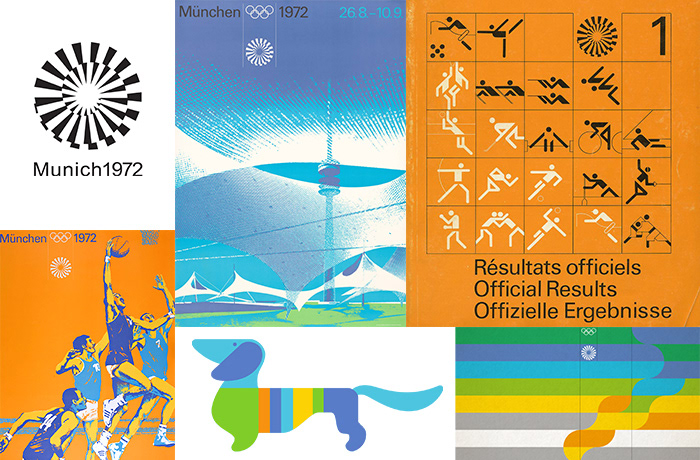
MUNICH 1972
Named the “Rainbow Games”, the 20th Olympiad in Munich elegantly combined joyful colours with Op Art graphics. An extensive series of promotional posters beautifully highlight the different sporting events. To create these images, a manual posterization process was used. Utilizing painted layers to isolate highlights and shadows from photo references, the layers were then applied with the colours of the Games. Otl Aicher’s pictograms set a new international standard of effective visual communication, which is understood across languages. Univers, the chosen typeface for the system, is expertly used in tandem with bands of colour in print applications. These stripes even make their way onto the mascot, Waldi the dachshund, and would be used as a similar design element by future Olympics in Montreal (1976) and Moscow (1980). Collectively, the visual decisions for Munich successfully achieve a sense of timelessness as they still manage to feel modern today, nearly fifty years later.
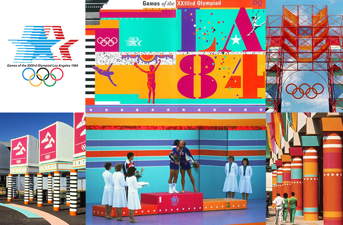
LOS ANGELES 1984
While the emblem uses the traditional red, white and blue of the USA, the full design system points in a more spirited and playful direction that makes the ‘84 Games instantly recognizable for its time and New Wave influences. Deborah Sussman and Paul Prejza used a toolkit of rudimentary shapes, arranged in a modular way, to create a program that was flexible and scalable. The overall visual effect of these decisions is something that is celebratory, almost toy-box like, as Grecian columns are modernized into vibrant colour-blocked pieces of magenta and turquoise, laced with stars and stripes. The system, named “festive federalism” translated seamlessly from two-dimensional applications to the retrofitted architectural environments of Jon Jerde (composed of scaffolding and sonotubes). Embracing the eclecticism of LA in an ephemeral way these design decisions temporarily transformed the city into a celebratory festival.

LILLEHAMMER 1994
The Winter Olympics in Lillehammer is particularly distinct for its celebration of folk art throughout the design system. A sense of craft, like the woodcut textures on posters and signage, permeated the system, giving it a distinct charm. A seamless pattern of crystalline forms, inspired by natural ice formations, adorned the venues and could be used at varied scales to create different compositions. This repeating device, also present in the emblem, served as a way to bridge together two colours within the palette and create a gradient. The pictograms for these Games take on a strikingly unique form referencing ancient Norwegian rock paintings. Having such a strong connection to local history helped better tell the story of the host city and created a look that was rich with narrative ability.
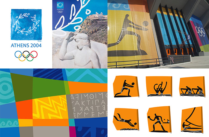
ATHENS 2004
The Summer Games in Athens brought the Olympics back to its origins in Ancient Greece. With such a wealth of history to explore and interpret, the look of the Games had to honour that heritage but also bring it into the future. Imperfect illustrative details throughout the system brought a humanistic character to the design, from the analogue feel of the olive wreath emblem, to the coloured bands of varying widths that overlapped and framed applications. Unlike modernist approaches, this look of the Games embraced expressive line over mathematical precision and allows for a flexible system which is warm and inviting rather than authoritative and corporate. Taking inspiration from ancient Cycladic figures and terracotta vase paintings, the pictogram collection instantly communicates the host city’s culture. Along with the colourful shades of blues and oranges, the system also incorporates neutral stone shades reminiscent of ancient architecture; in this way creating a mosaic of the old and new coming together.
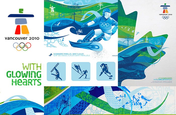
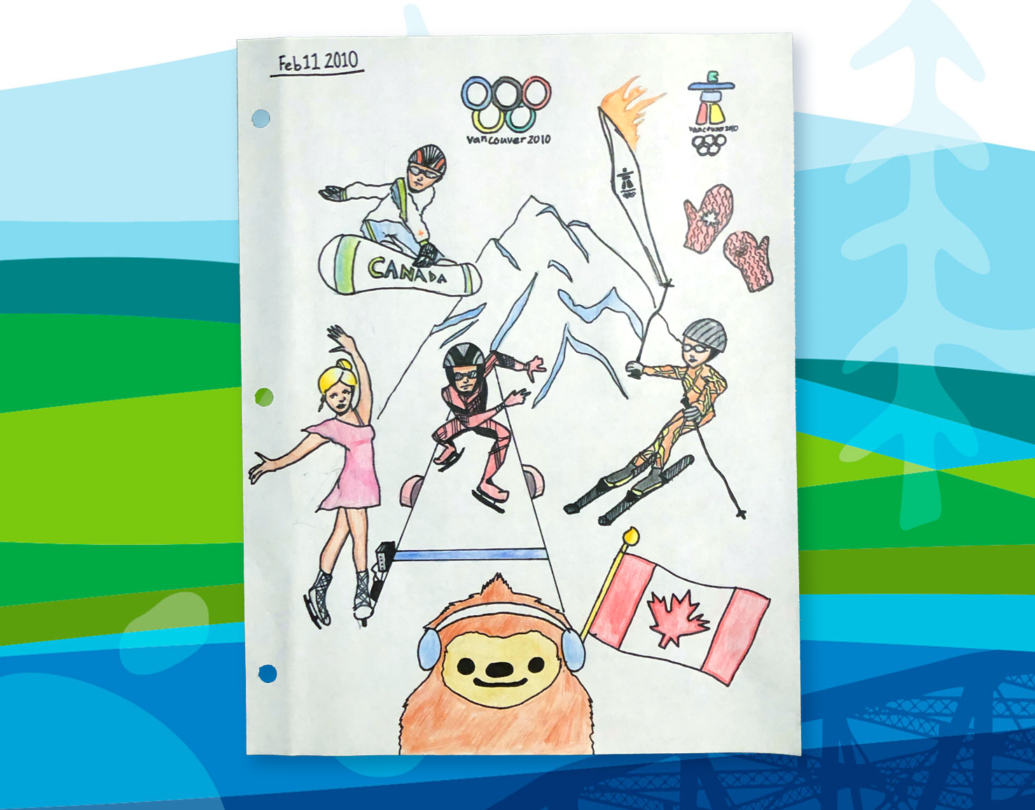
VANCOUVER 2010
The challenge of the Vancouver Winter Games was to define for the world what a 21st Century Canada looks like, avoiding traditional visual trappings. The colour palette, which stretches from “sea-to-sky”, departs from the dominant red of past Canadian host cities. The primary graphic featured free-flowing curves and hybrid illustrations which combine natural and man-made structures referential to Western Canada and a coastal host city. Expressing in one graphic both the natural beauty of the land and the urban infrastructure of a bustling city. When applied to extensive applications of the Games, the richness of this visual language could be fully communicated. Pictograms for Vancouver included detailed versions which could be used on large scales in combination with other design elements. The typography further supports the organic curves seen throughout the system; its friendly rounded forms spelling out the slogan of the Games, “With Glowing Hearts.”
For more information about Olympic design, a new two-volume book has been published titled: Olympic Games – The Design