This piece was published on RGD as part of their At First Sight series where designers are asked to talk about a design they saw when they were young that influenced their decision to become a designer.
You might remember watching Alex Bilodeau win Canada’s first gold medal on home soil, seeing Tessa Virtue and Scott Moir’s captivating ice dance program, or maybe even Jon Montgomery’s pitcher of beer celebration in Whistler. From February 12 to 28, 2010, Vancouver hosted the 21st Olympic Winter Games, marking Canada’s third time hosting the Olympics and its first in the new millennium. As a 13-year-old, I was the perfect age to take in the competition. Wearing my Olympic Hudson’s Bay sweater, which I got for Christmas, I stood in Hawrelak Park in Edmonton to watch the torch pass as part of the relay leading up to the Games. While I was not regularly a sports watcher, the Olympics offered that rare feeling of the world’s eyes all being on one spot, and I couldn’t look away. Reflecting back, I now see how that special two-week period in Vancouver would inspire so much of my future in design and what I want to create today.
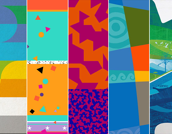
Watching the broadcasted events, there was something consistent in the backdrop for all these sporting moments. A foundational piece of graphic design brought together branding and illustration into a storytelling device to represent an entire nation. Across the athletic bibs of skiers, the kiss-and-cry area for figure skaters and on the dasher boards of the hockey rink, there was the same graphic that told the story of Vancouver—an illustrative mural of blue and green waves with intricate ornamentation and pattern. I didn’t have the language to know what it was called then. Still, I would later discover it to be part of the "Look of the Games", a highly sophisticated and integral piece of any Olympic design project that defines the visual system for all brand applications.
Let me take you back to its creation. Ali Gardiner organized the internal design team as the Head of Brand and Creative Services for the VANOC Organizing Committee. She brought on Leo Obstbaum as the Director of Design, and he would grow the team to a staff of 24 employees, in addition to freelance illustrators and designers. This super- team of creative minds had to tackle one of design's biggest challenges, a global short-term event with years of lead-up and thousands of applications. Not to mention, being part of a lasting legacy in a rich design history that includes legends like Lance Wyman (Mexico City 1968), Ottel Eicher (Munich 1972) and Deborah Sussman (Los Angeles 1984).
The team began work on the Look of the Games in 2006 with field trips around Vancouver. British Columbia’s largest city blends with nature, transforms through the seasons and fuses the natural world with a man-made metropolis. “Sea to sky” became a defining concept even in the earliest days of planning the Games. This visual embrace of the oceanfront and mountaintops, all contained within the province, is reflected in the shades of blues and greens that span the design program; with this relatively limited colour range compared to other Olympics, the collective impact is very clear in my memory.
The foundational structure for the Look of the Games is a landscape of curving waves, layers of hills and a backdrop of mountains. On its own this could be fairly generic, but what I enjoy about the solution is the layers of detail that are applied to this foundation. The transformation of the ever-changing city and natural world it inhabits is depicted through patterns inlaid into the foundation shapes. Circuit boards mix with wood textures, and the masonry of the streets of Gastown is contrasted with hand-drawn leaves and sea foam. Perhaps the most surreal choice, and one that I bet many of us missed without close inspection, is the collision of the man-made with the natural in an array of Dali-esque silhouette illustrations sprinkled throughout the motif. In a peak 2000s expression of flat silhouetted vectors, a dandelion combines with a windmill and stalks of bamboo to form the masks of a boat. These humorous inventions create delight and surprise as we observe this world. For added meaning, a series of tree silhouettes were created to represent each province and territory. The system resulting from all these tools is flexible, croppable and maintainable across thousands of applications while still capturing the unique story the team envisioned. Special mention should be given to Irene Maria Jacobs, who illustrated the detailed sports overlays that were often imposed on r the Look of the Games graphic. Heroic detailed imagery of athletes rendered in monochromatic blues, these figures would also form the starting point for the sports pictograms.
As a teenager, I think I was first compelled by the sheer beauty of the graphics. Getting the coin collecting booklet, saving a tag from a piece of branded merchandise and seeing the graphic on every televised venue from Vancouver to Whistler caught my attention. I saw the functionality of it as a way to unify the locations under one umbrella. I also saw the brand’s potential in how it was designed within the geographic and cultural contexts of the host city, province and nation. This graphic represented where I lived, and I was proud of that.
An illustration I created while watching the opening ceremonies.
In this project, I saw the art-making I loved as a child being honed for a practical purpose. That artwork would be seen by millions of Canadians and billions worldwide. It did an important job of branding a whole country to the world. That sparked my love of Olympic design, and my easy answer to anyone asking me my dream design assignment would be. While watching the Games, I had sketchbook pages doodling the mascots, drawing fashion ideas for Team Canada uniforms, and sketching my own brand typeface.
For me, the 2010 Olympics are marked not just by moments like Sidney Crosby scoring the game-winning goal in Men’s hockey but by the efforts of the VANOC Design team’s fantastic work to give identity to the host city.
