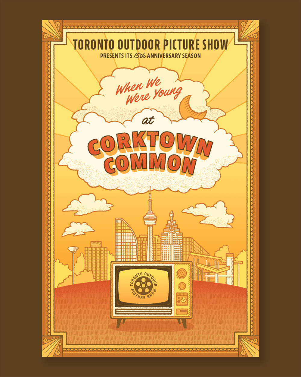
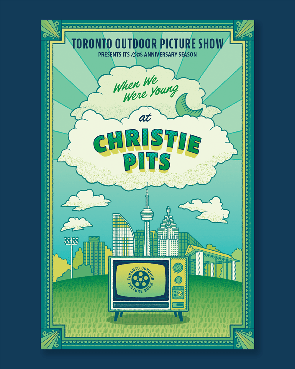
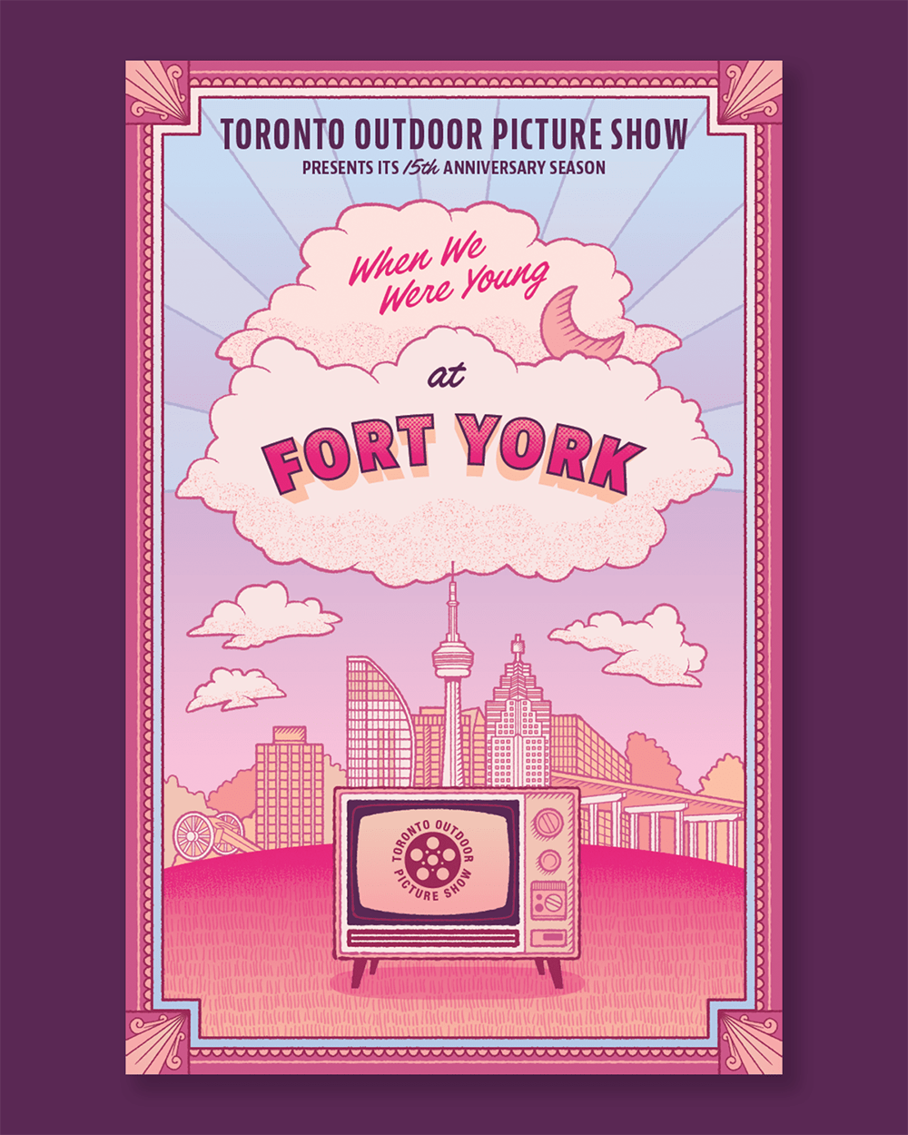
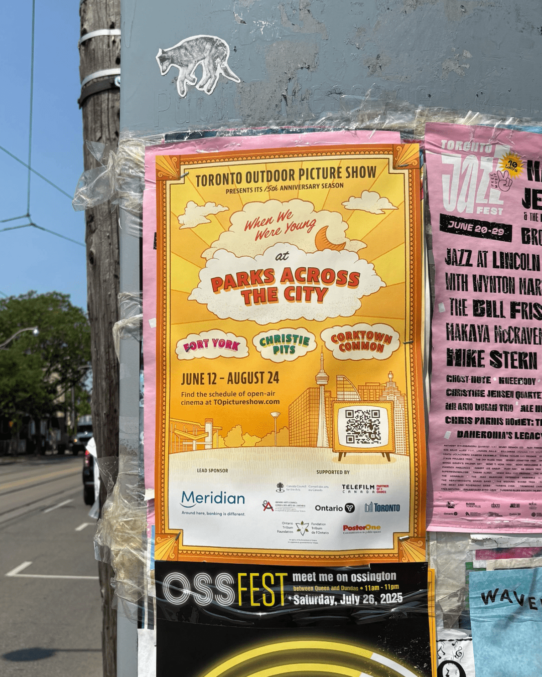
Art Posters
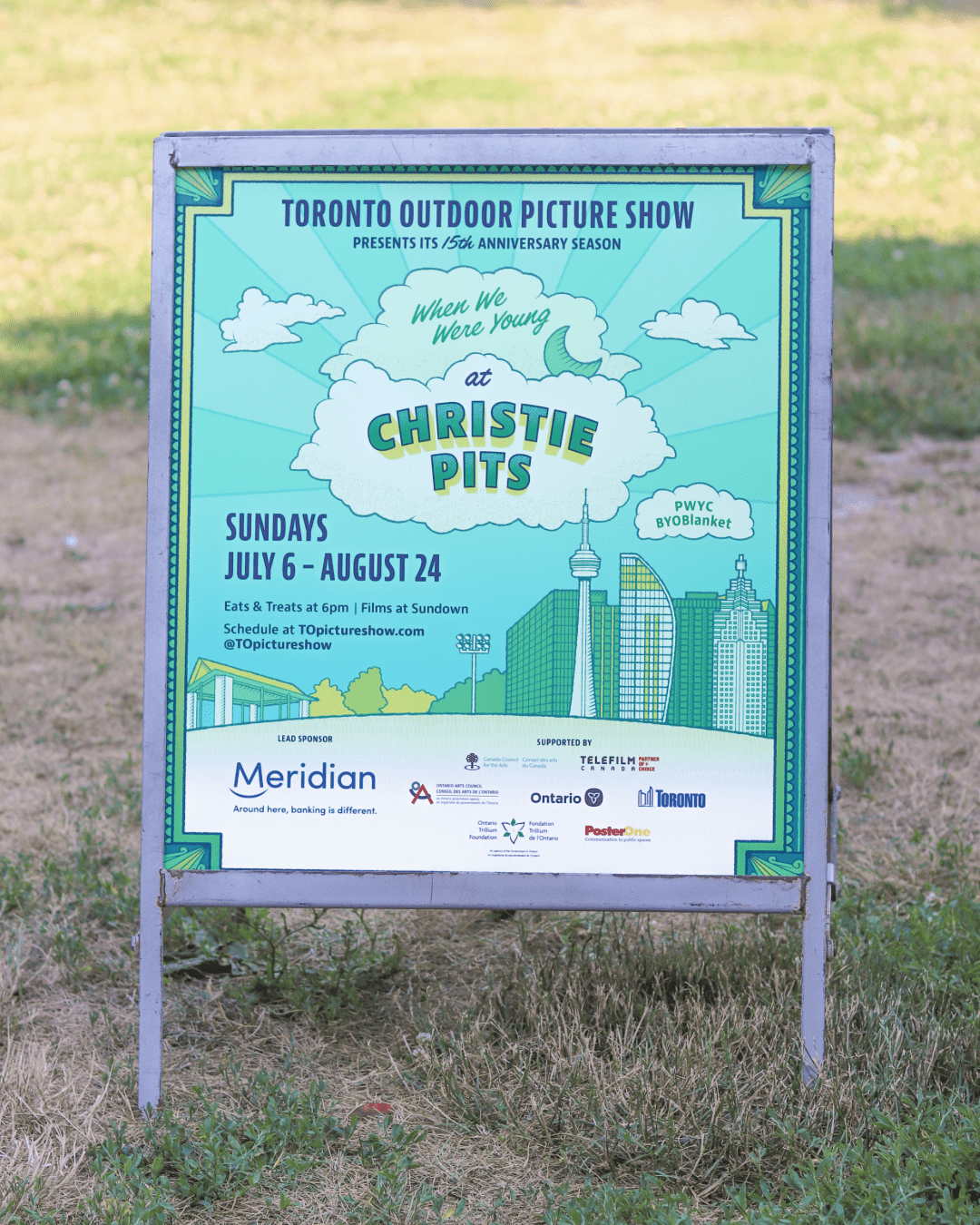
Three colourways were created to differentiate the three parks where TOPS screenings take place: Corktown Common, Christie Pits, and Fort York, each poster features a unique landmark from the parks added to the Toronto Skyline.
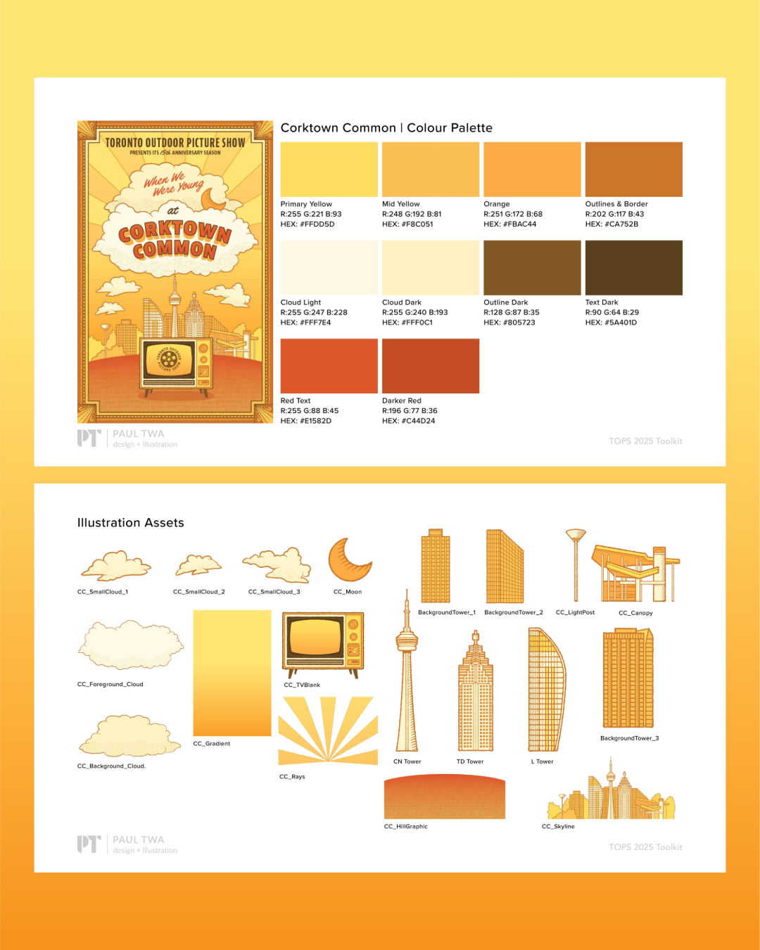
Modular Illustration System
As part of the work, I packaged and delivered a comprehensive brand guide for the season. This included the palette for each park and individual exports of each illustration element used within the posters that could be further repurposed on future marketing materials, video content, and social posts.
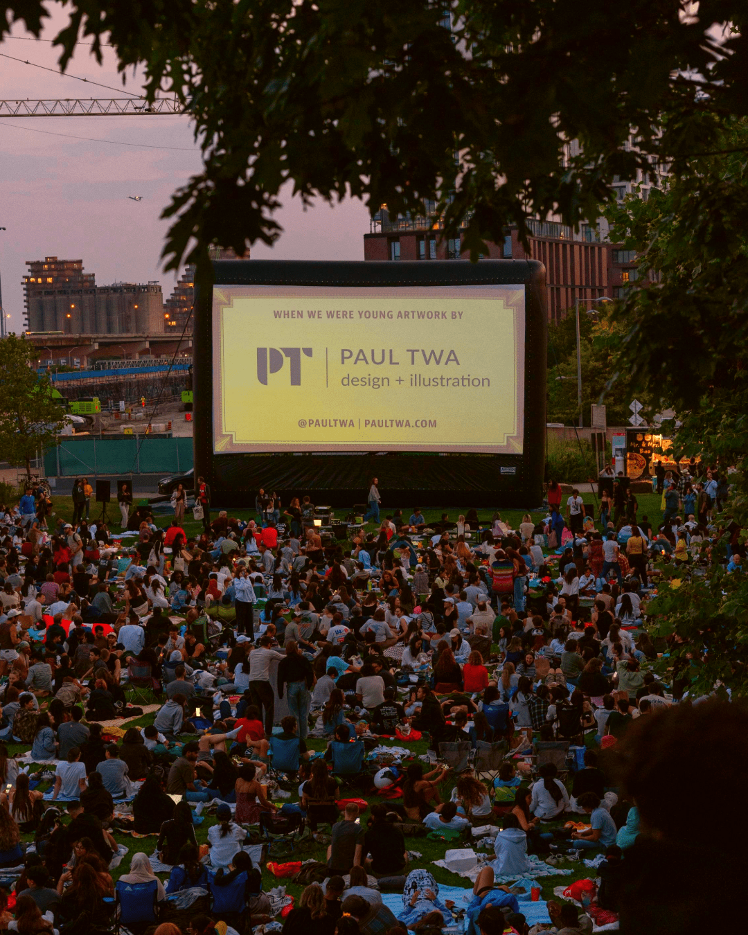
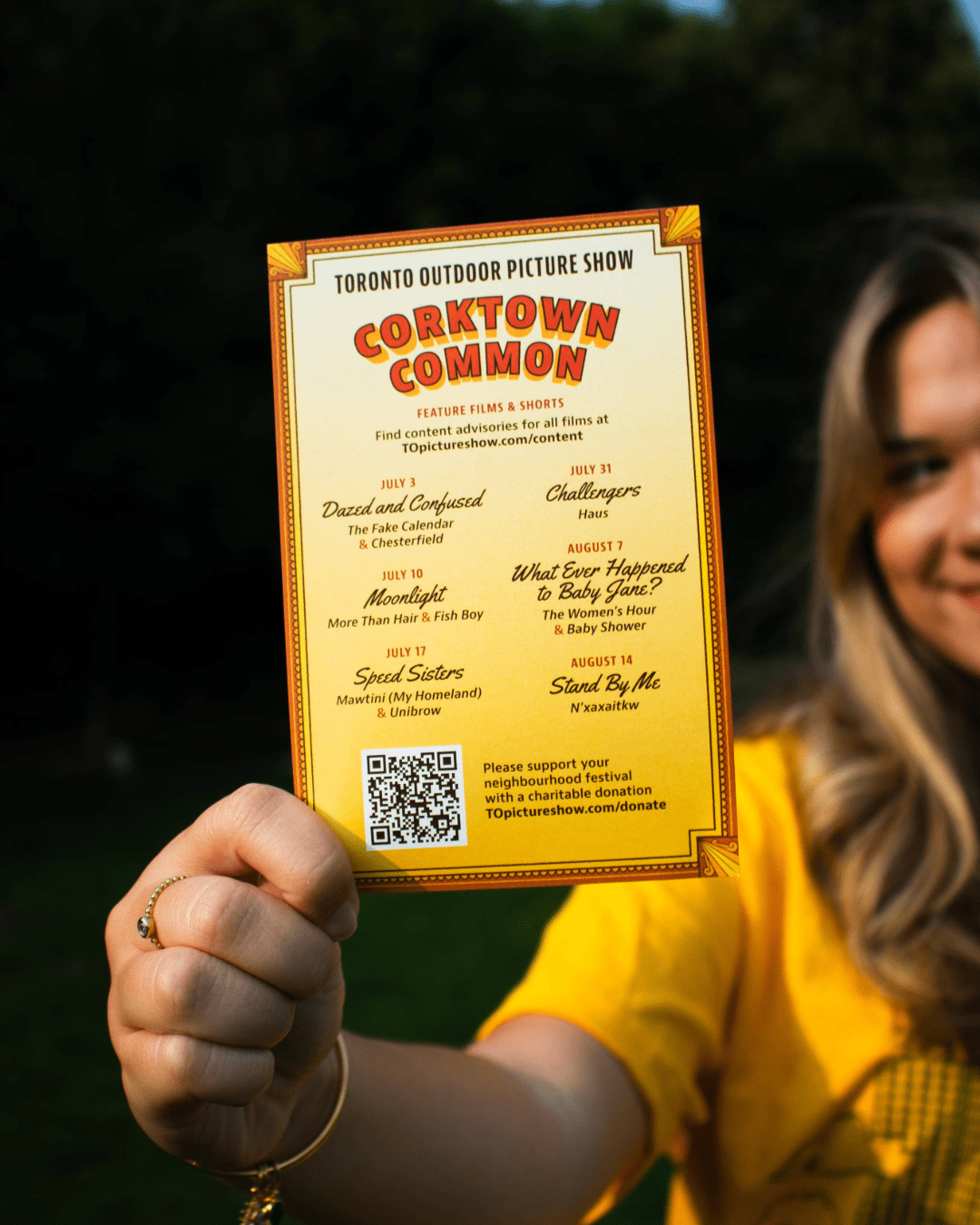
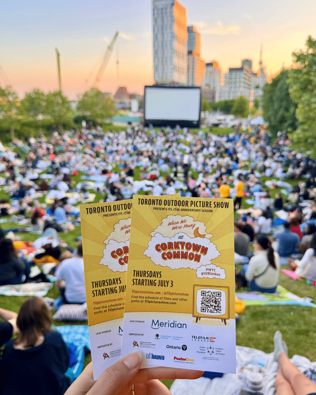
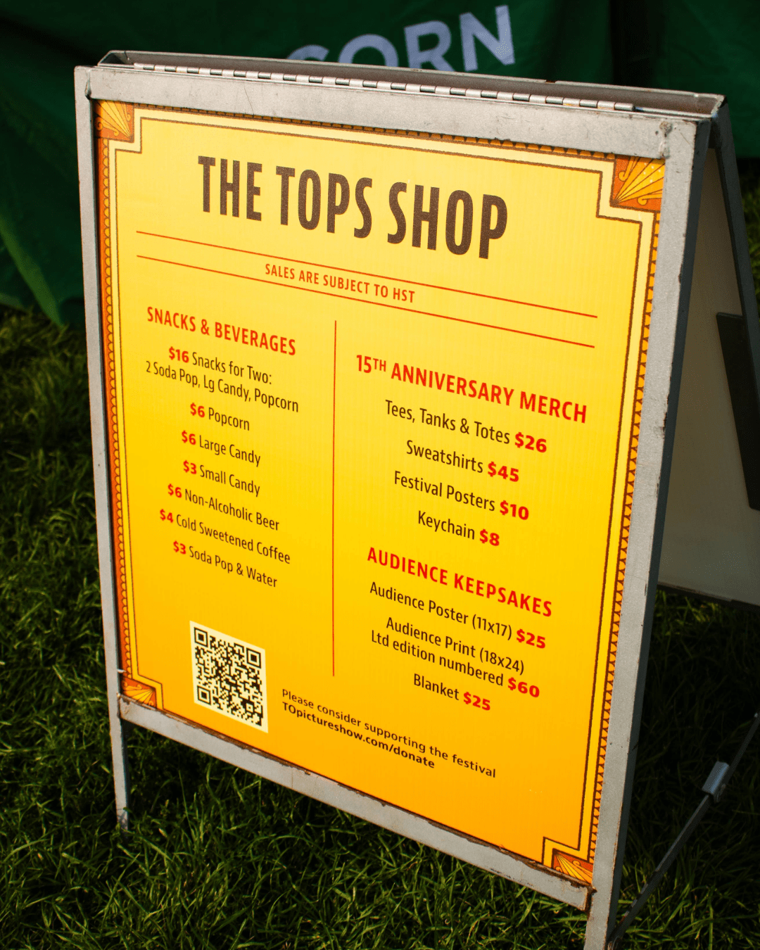
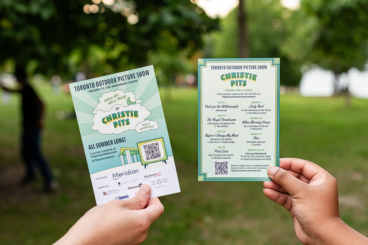
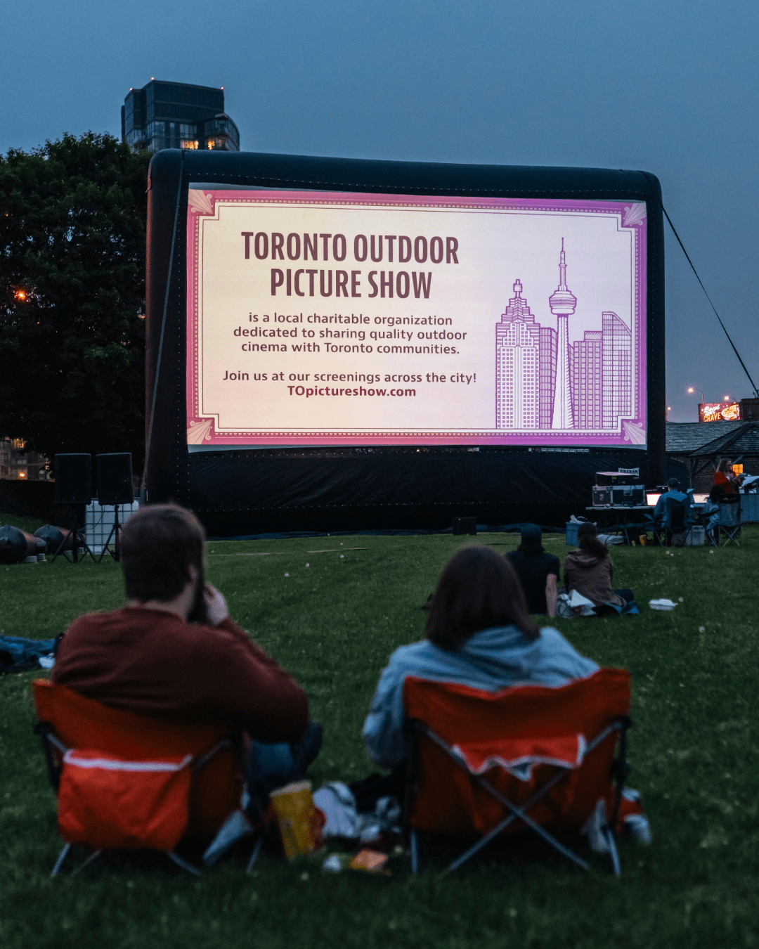
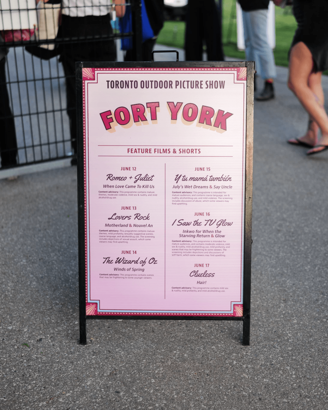
Event Deliverables
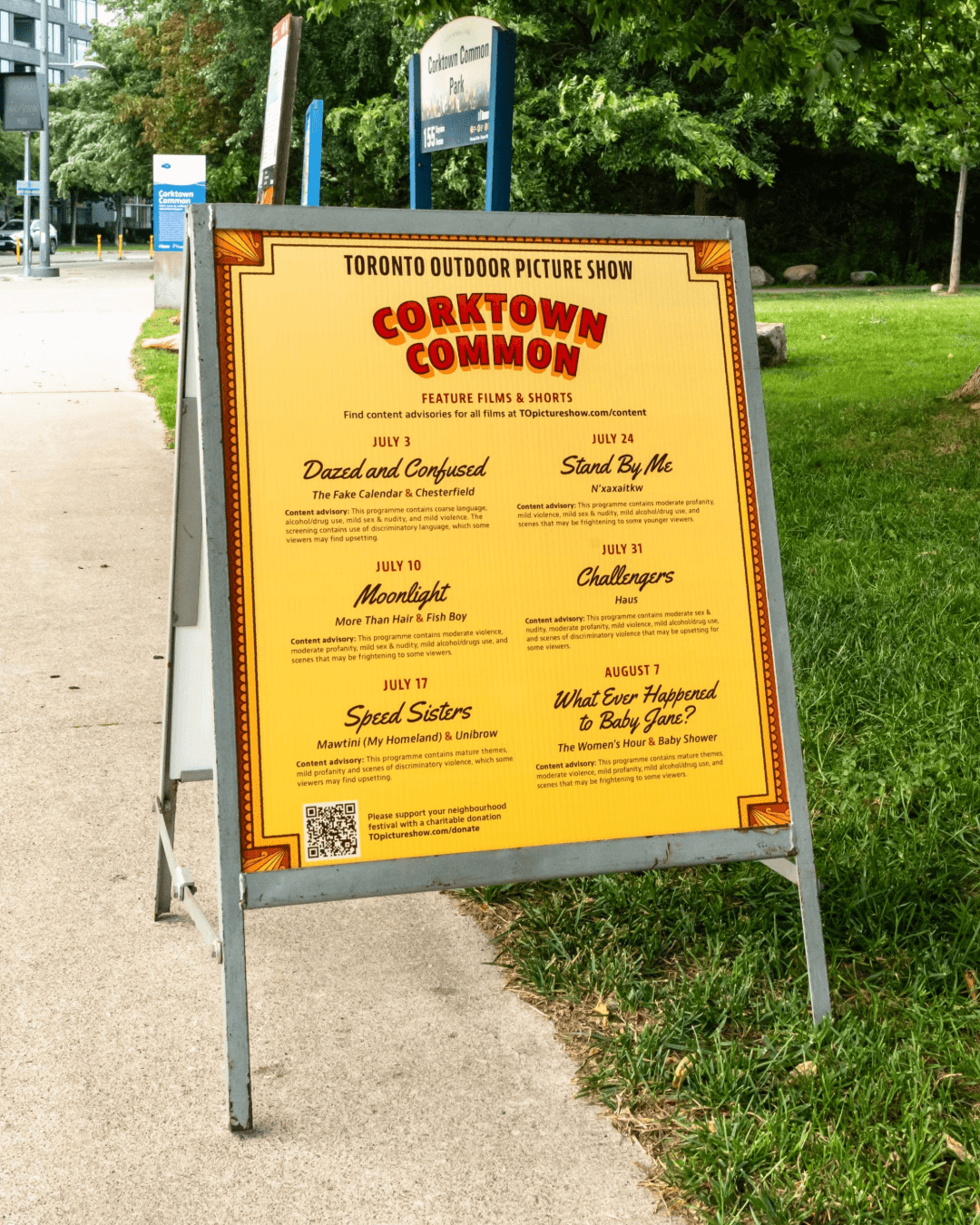
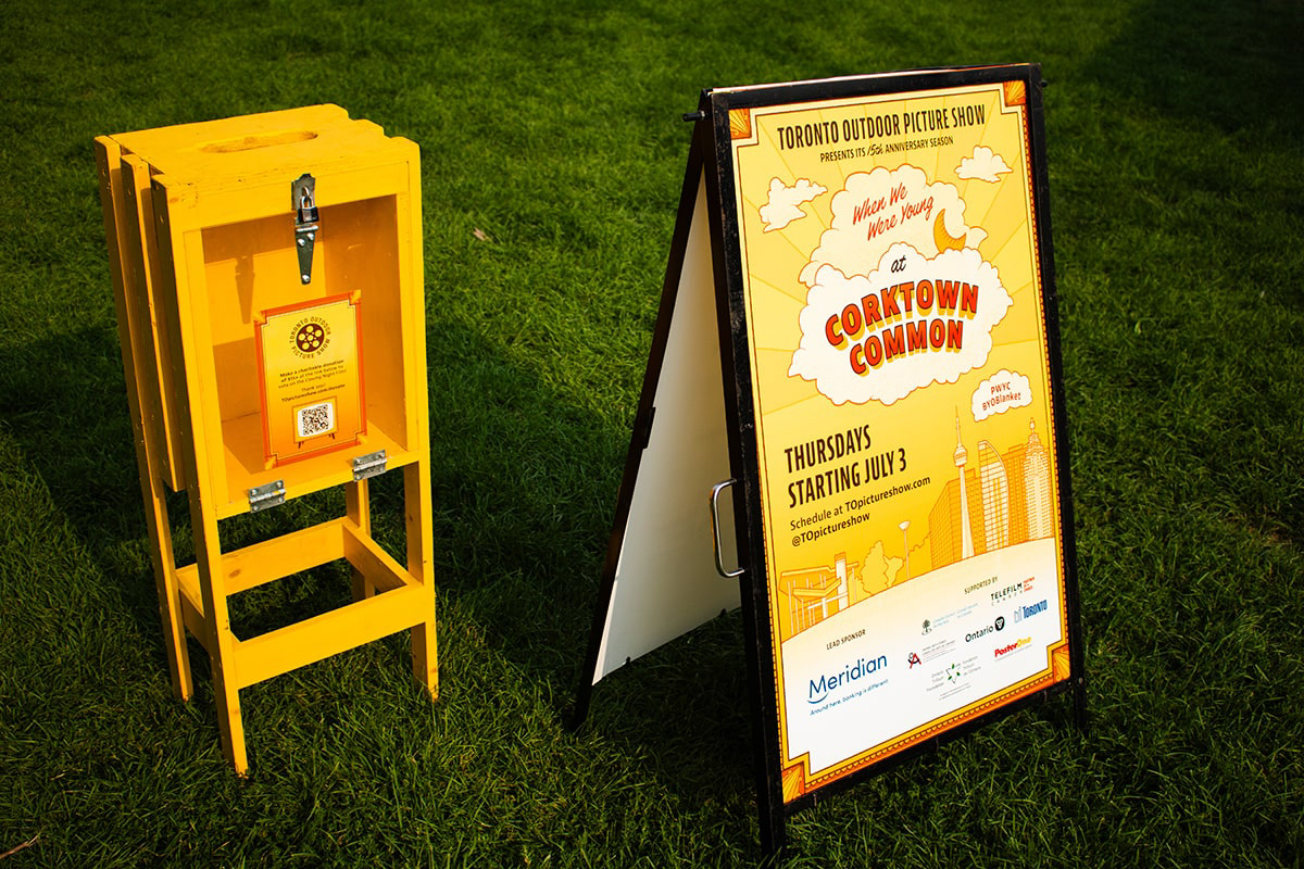
I designed dozens of signs displaying programming details, activities, concessions, and merchandise for sale at the screenings. Postcards and staff/volunteer badges were also created. During the pre-show, hundreds of digital screens were developed, consistent with the colourway of the park.
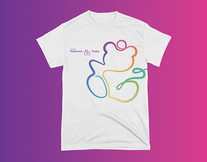
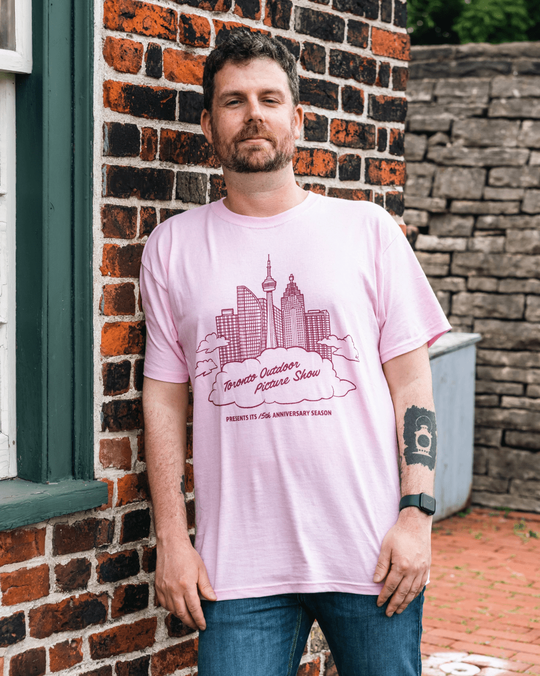
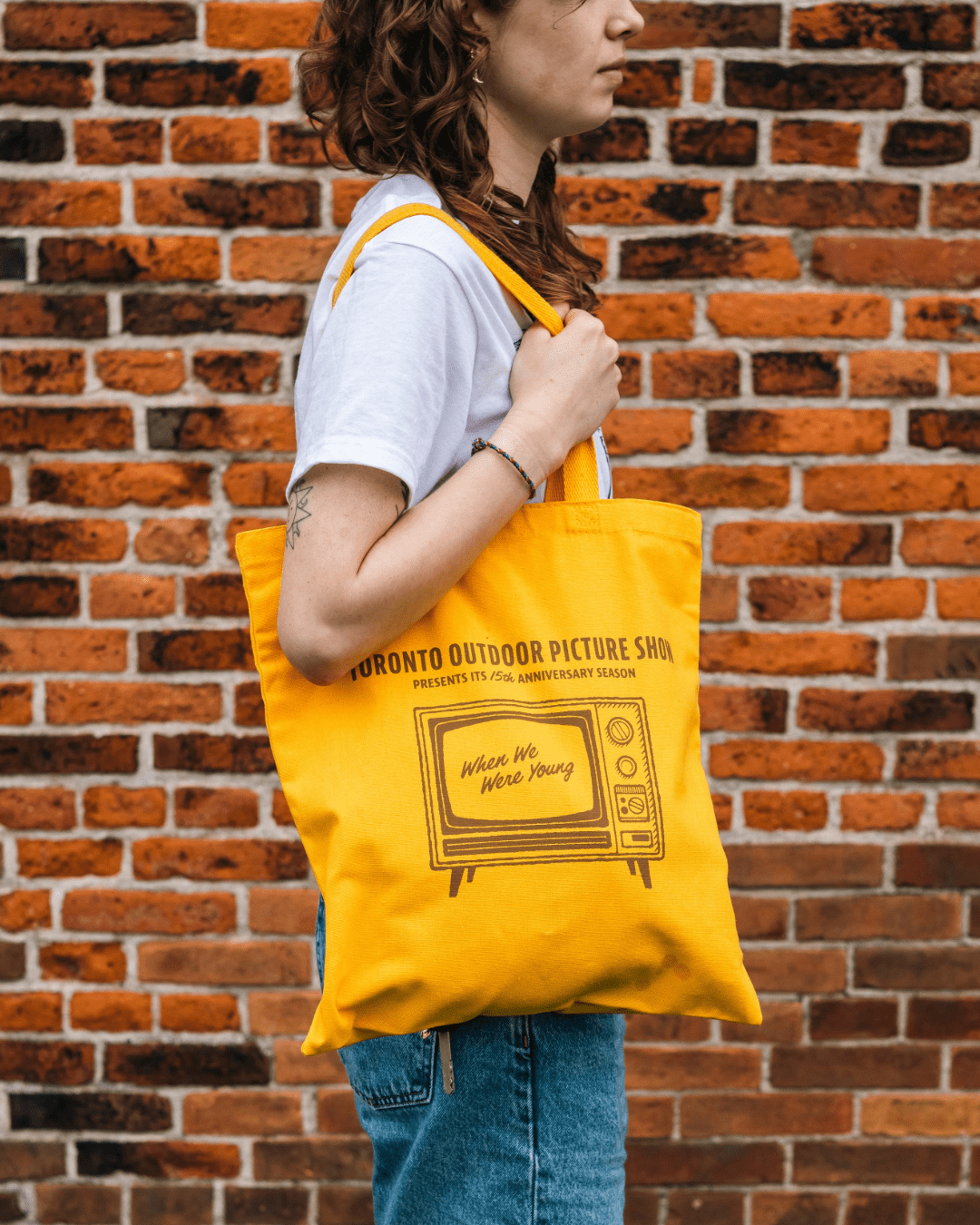
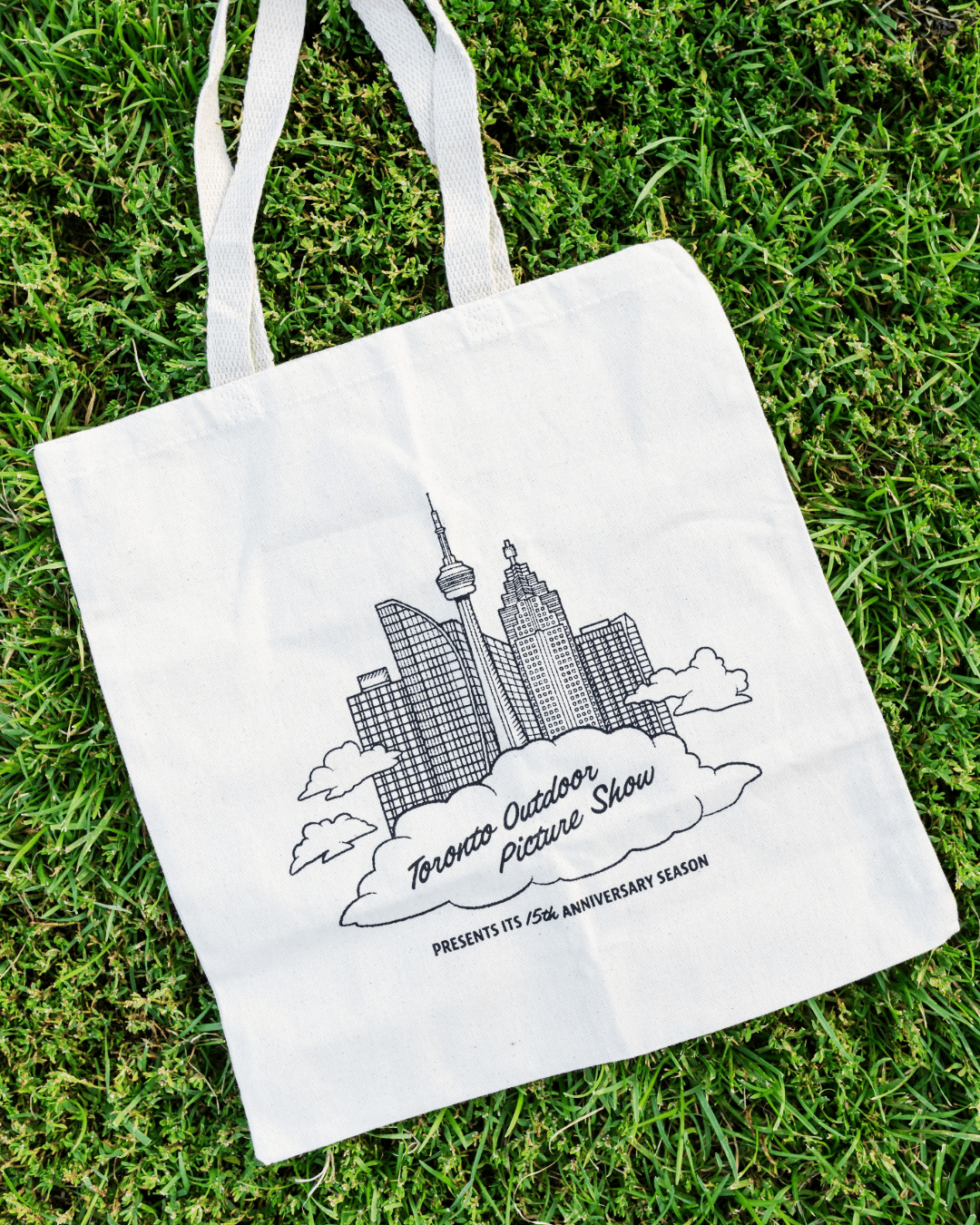
Merchandise Designs
Logo Refresh
Celebrating its 15th anniversary, I refreshed the TOPS logo to refine elements in order to make it more usable for the years to come.