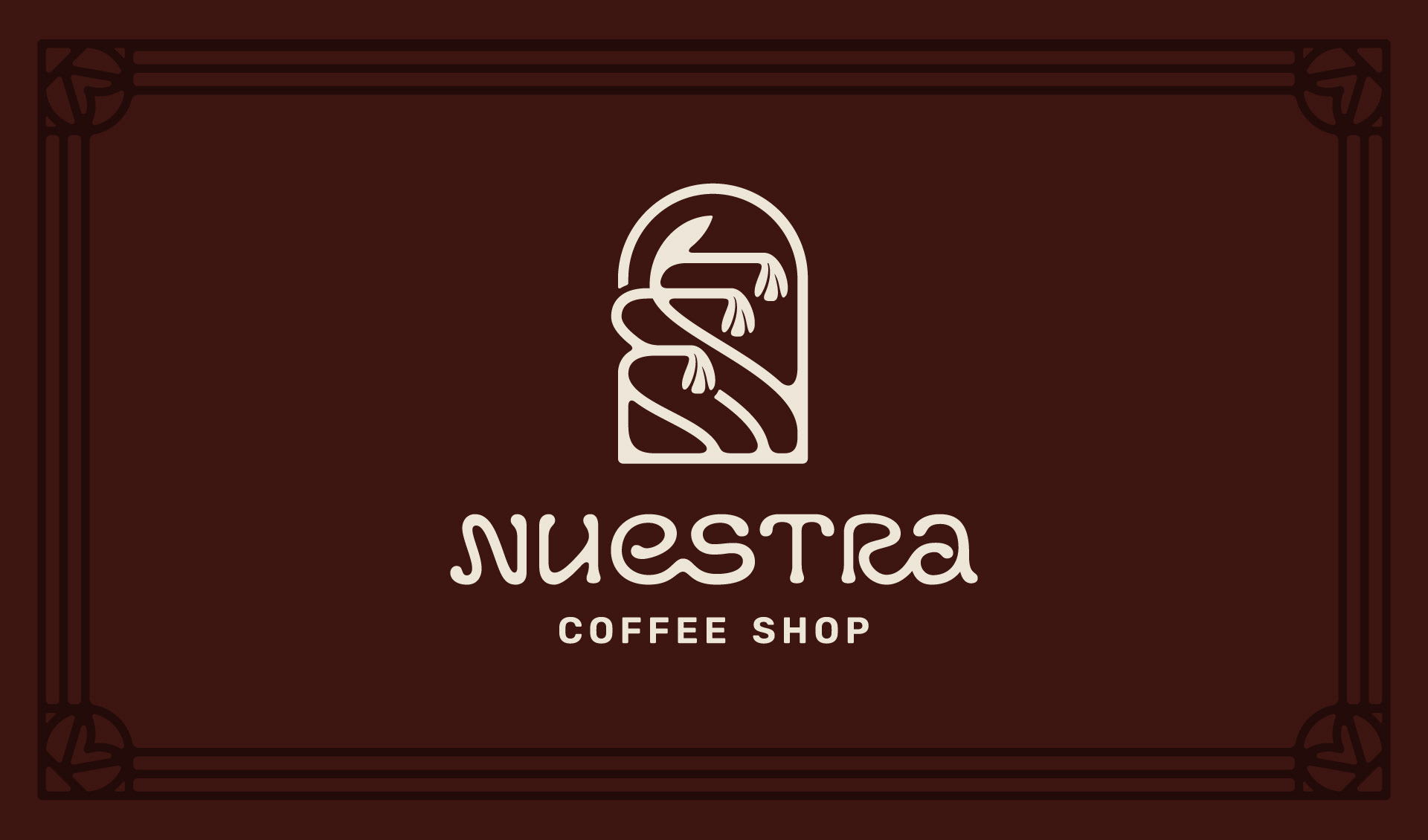
Wordmark & Emblem
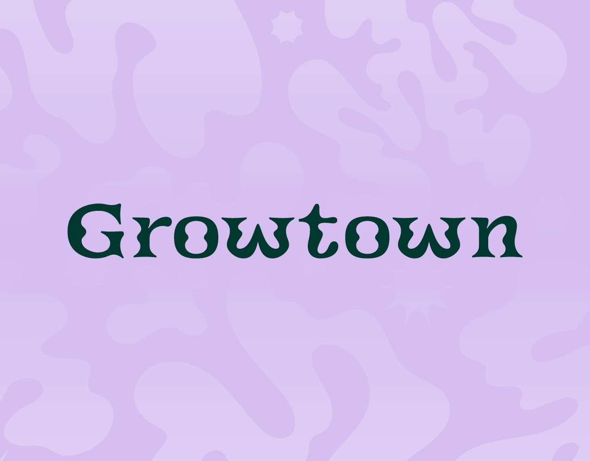
This hand rendered wordmark was carefully crafted and refined through proofs and collaboration to strike the right balance between readability and expression. Starting with iterative sketching, the unique ligatures were created and the distinctive bulbs on the end caps of the letterforms.
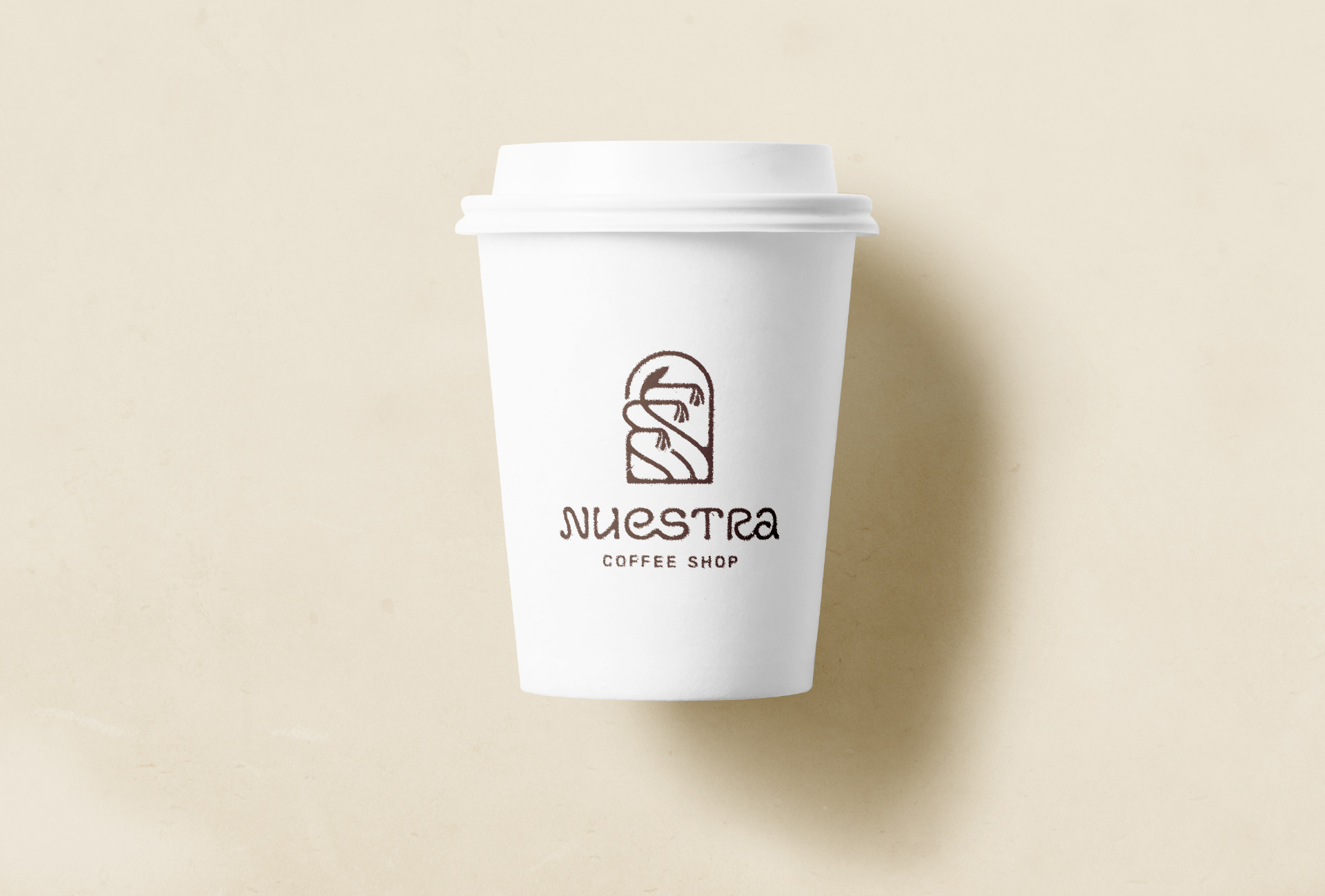
To complement the wordmark I drew an emblem depicting the Chilean Bellflower (Lapageria Rosea). This national flower from Chile has a connection to the owner’s story and was also fitting for the nouveau foundation of the brand.
To complement the wordmark I drew an emblem depicting the Chilean Bellflower (Lapageria Rosea). This national flower from Chile has a connection to the owner’s story and was also fitting for the nouveau foundation of the brand.
Primary Logo
Brand Elements
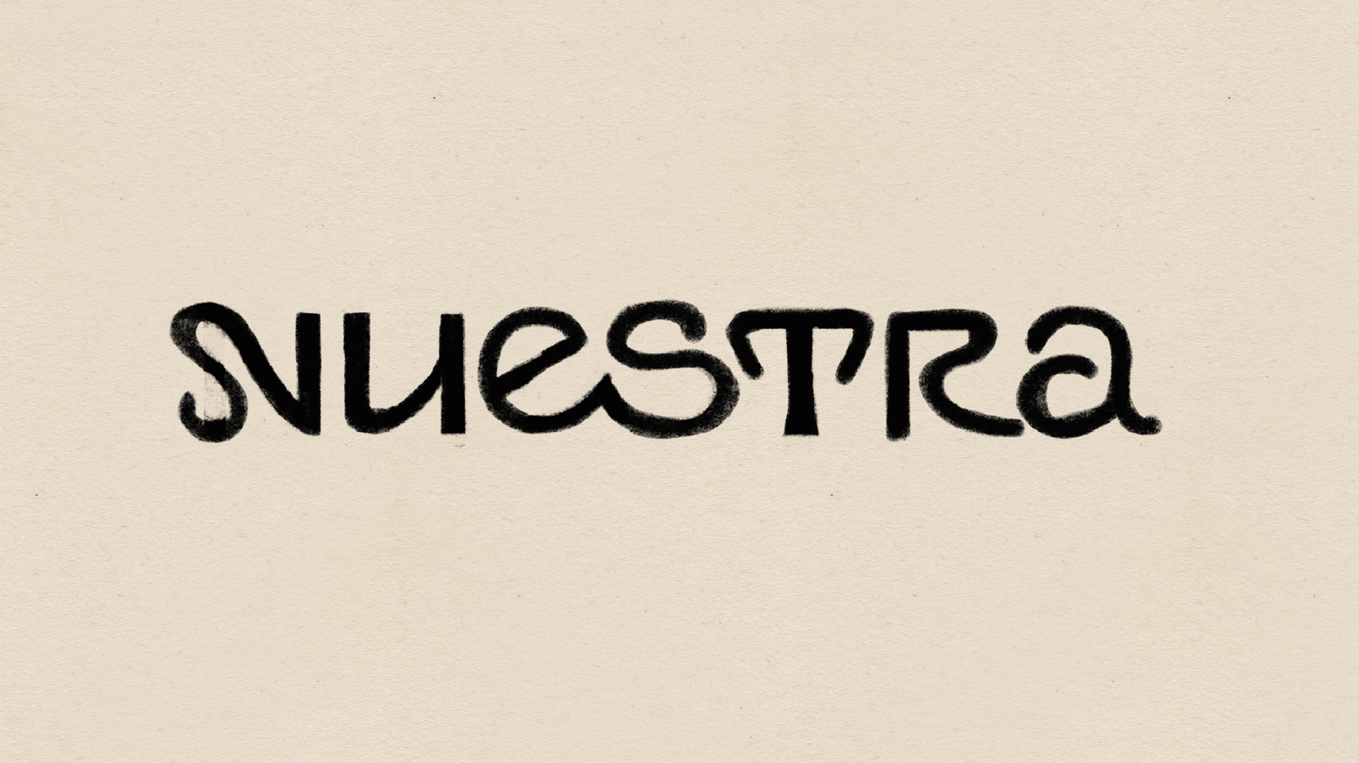
Wordmark development process and alternatives

Storefront Signage
Coffee Cup Stamp
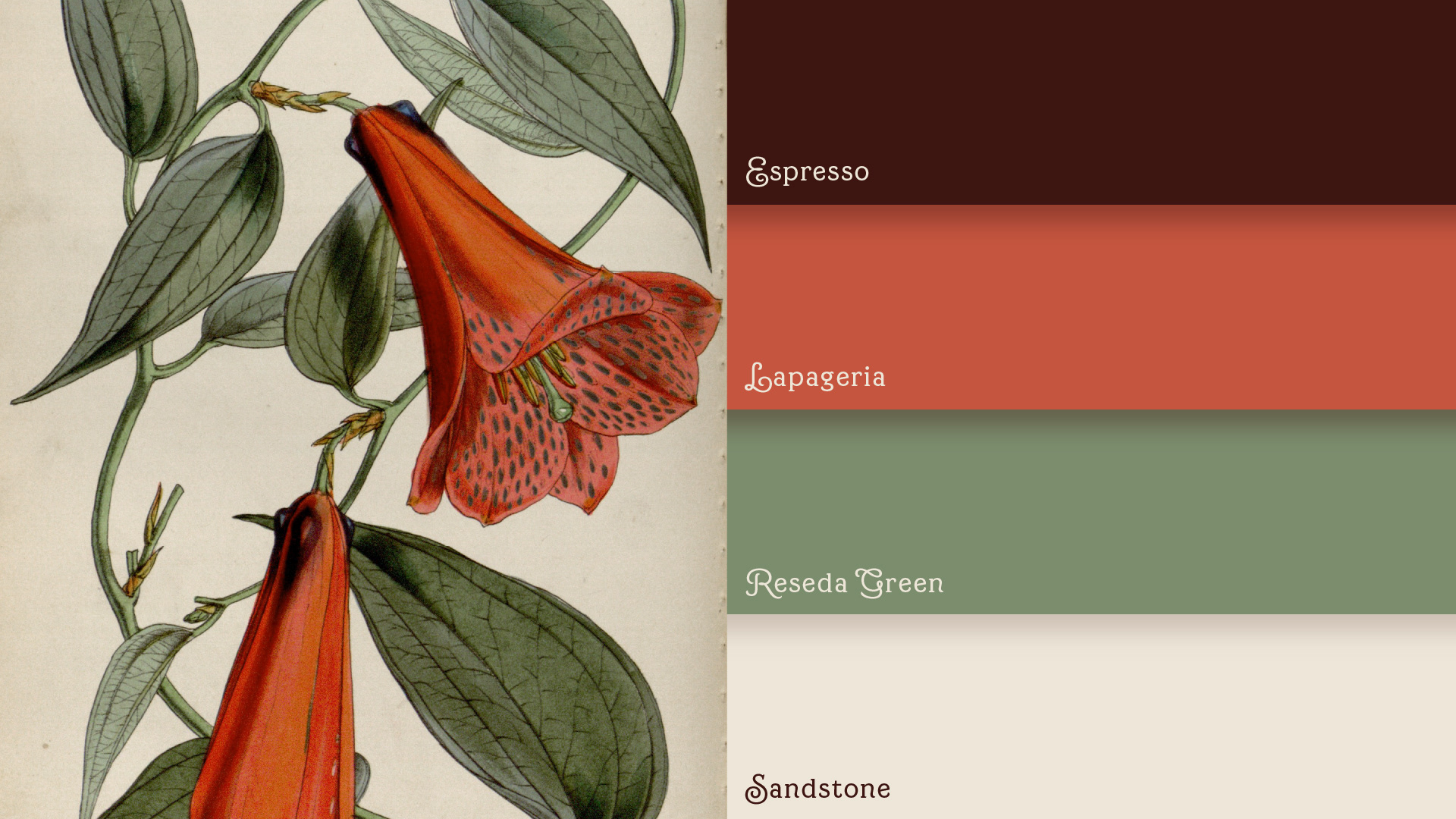
Chilean Bellflower & Colour Palette
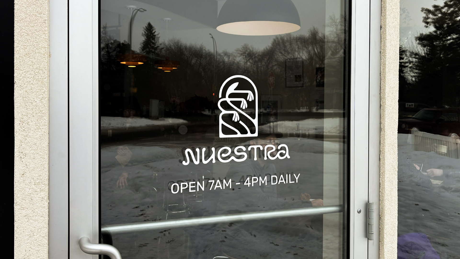
Window Vinyl
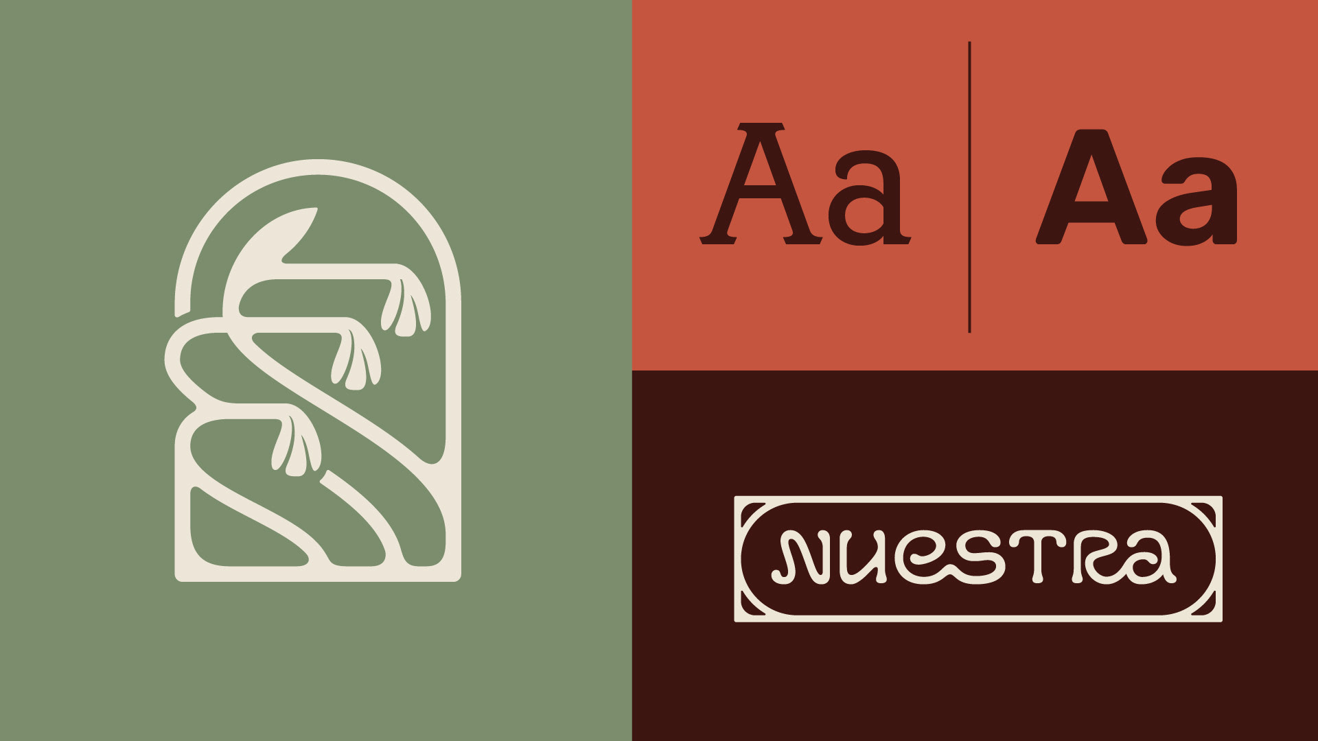
Brand Typography
Typographically, Canturiana was selected as a typeface. Created by Chilean type foundary, Latinotype, this face offers curved serif letterforms and a truly beautiful array of glyph alternatives that have made their way onto exterior/interior signage and menu boards in the space.

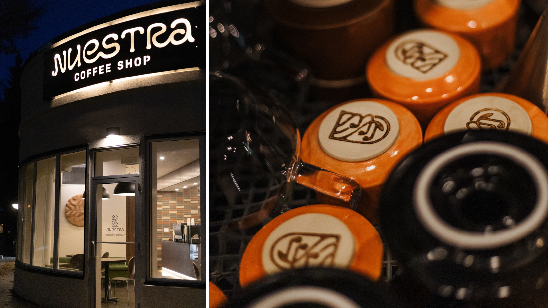
The co-owner of Nuestra, Nichola Hildebrand, handmade all the ceramic drinkware in the shop and incorporated the emblem onto the bottoms of each mug, glazed in the brand colours.