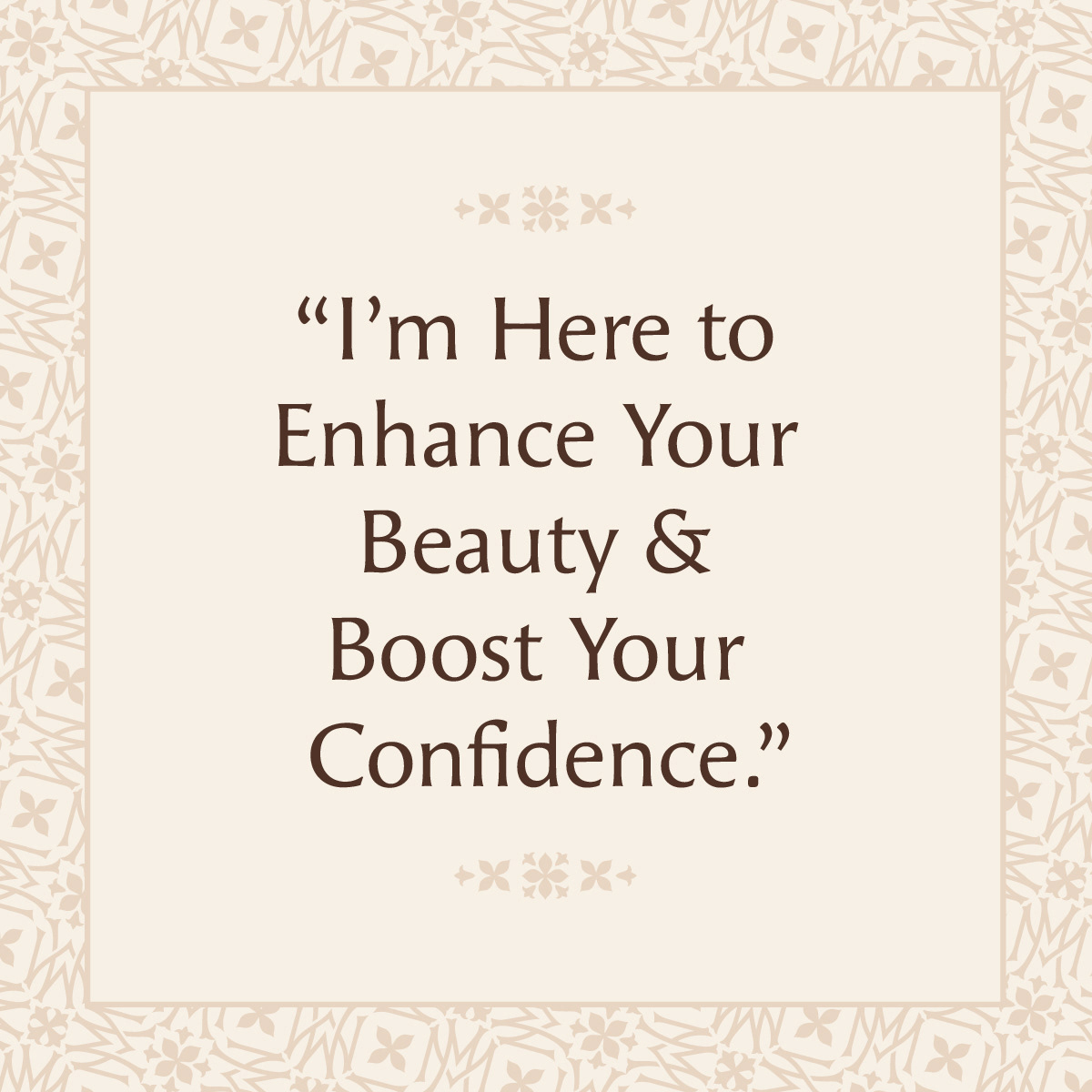
Following an audit of the existing landscape of makeup artists in BC and beyond, the brand I developed needed to stand apart by communicating a feeling of established luxury that comes from Marianne’s honed skills and taste. In this way deviating from more girly scripts or overly referential forms and instead presenting a matured, confident femininity.
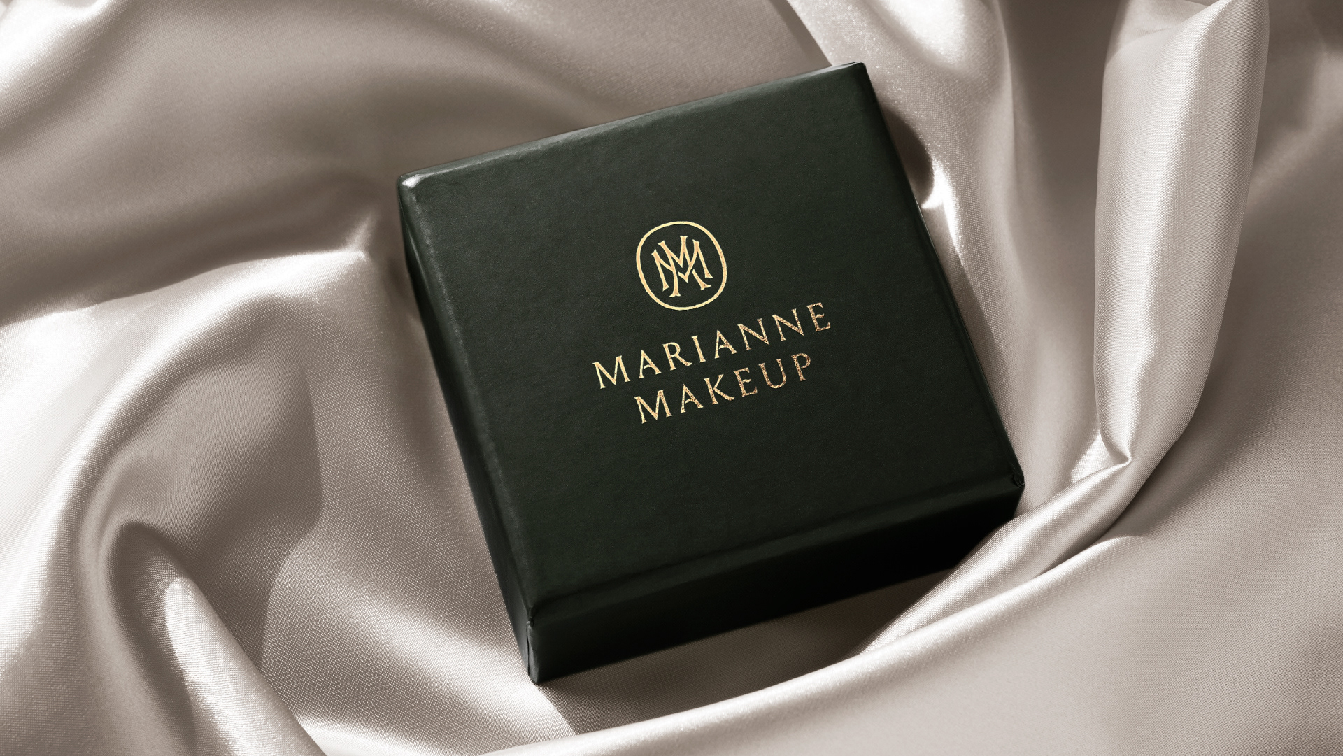
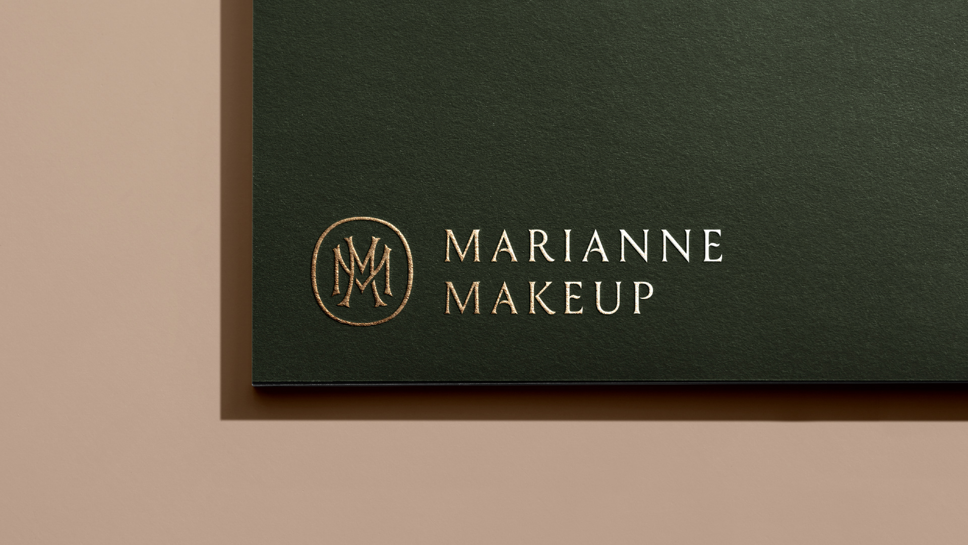
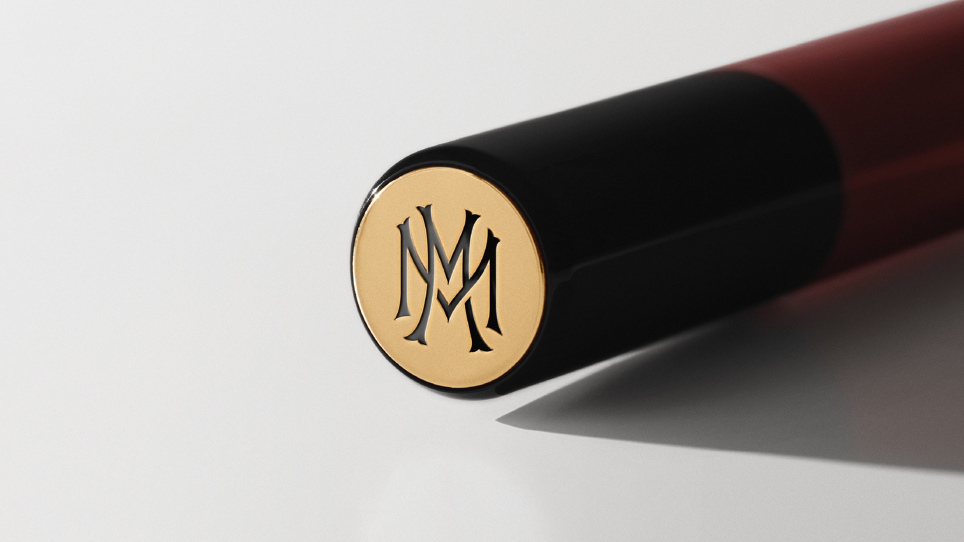
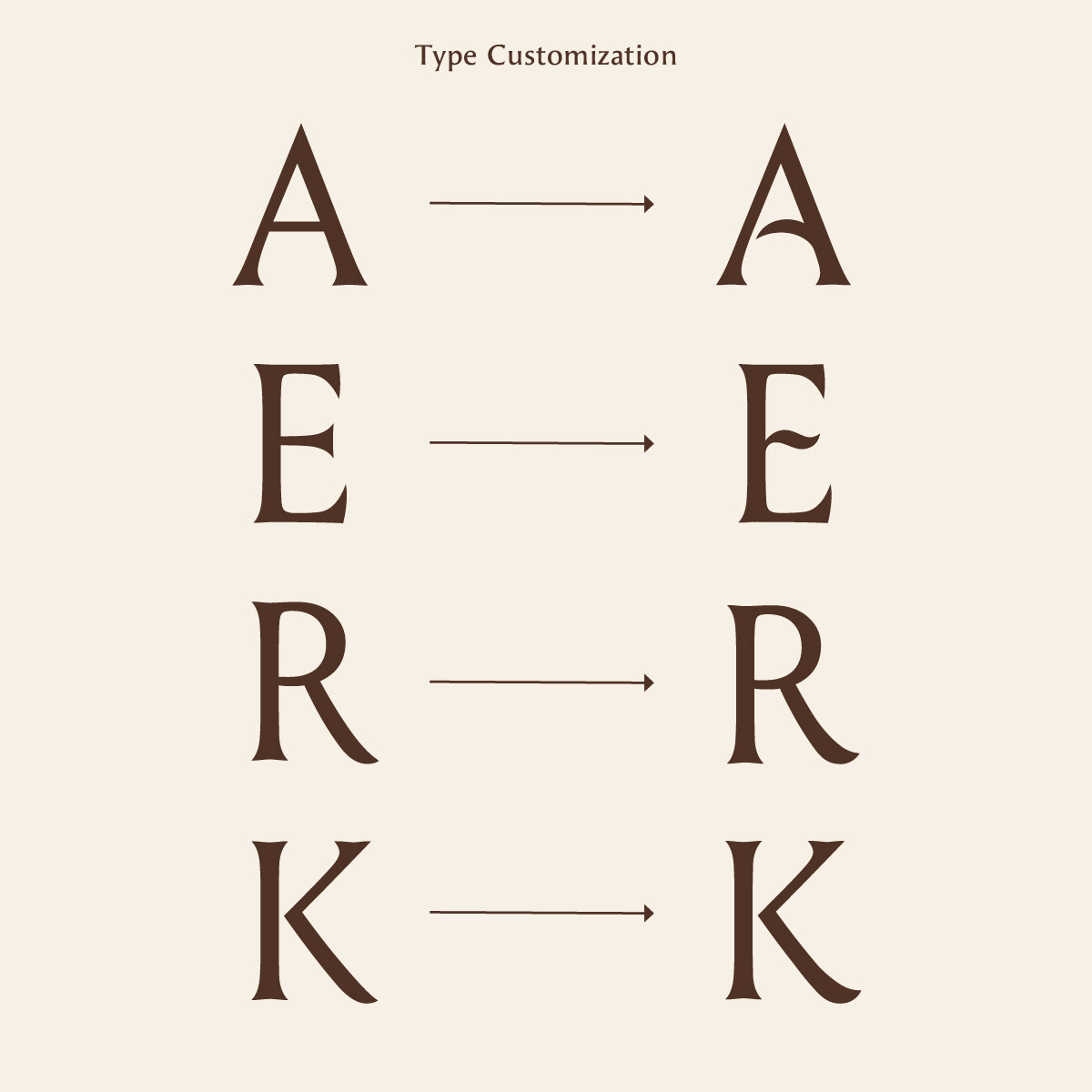
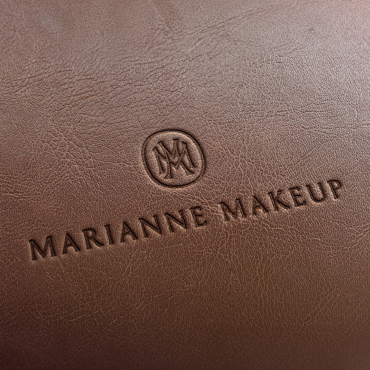
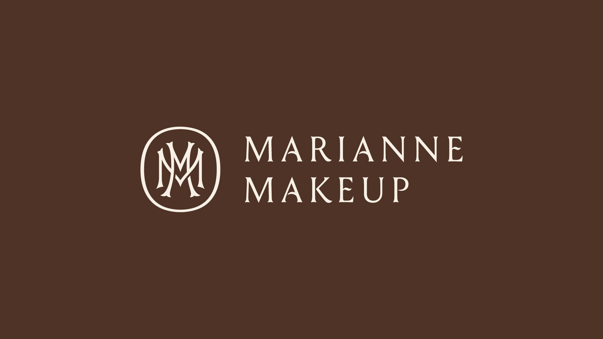
Marianne plays a crucial role in her clients big day which requires a skilled hand and tasteful eye. The mark was designed to convey this through a customized classical serif, reminiscent of chiselled stone inscriptions. A double M monogram harkens back to historical interconnected wedding monograms and the signatures of creative guilds and craftspeople. I drew the ‘M’s with Tuscan serifs for added personality and to bring out the natural interior arch of the serifs in the wordmark.
Marianne plays a crucial role in her clients big day which requires a skilled hand and tasteful eye. The mark was designed to convey this through a customized classical serif, reminiscent of chiselled stone inscriptions. A double M monogram harkens back to historical interconnected wedding monograms and the signatures of creative guilds and craftspeople. I drew the ‘M’s with Tuscan serifs for added personality and to bring out the natural interior arch of the serifs in the wordmark.
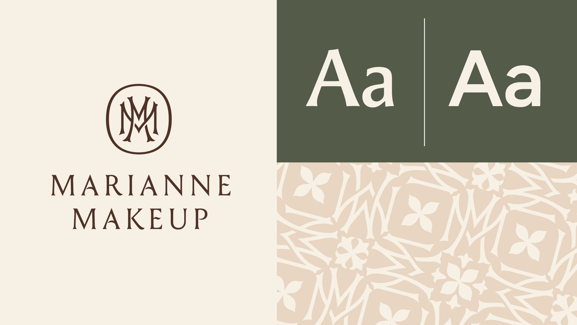
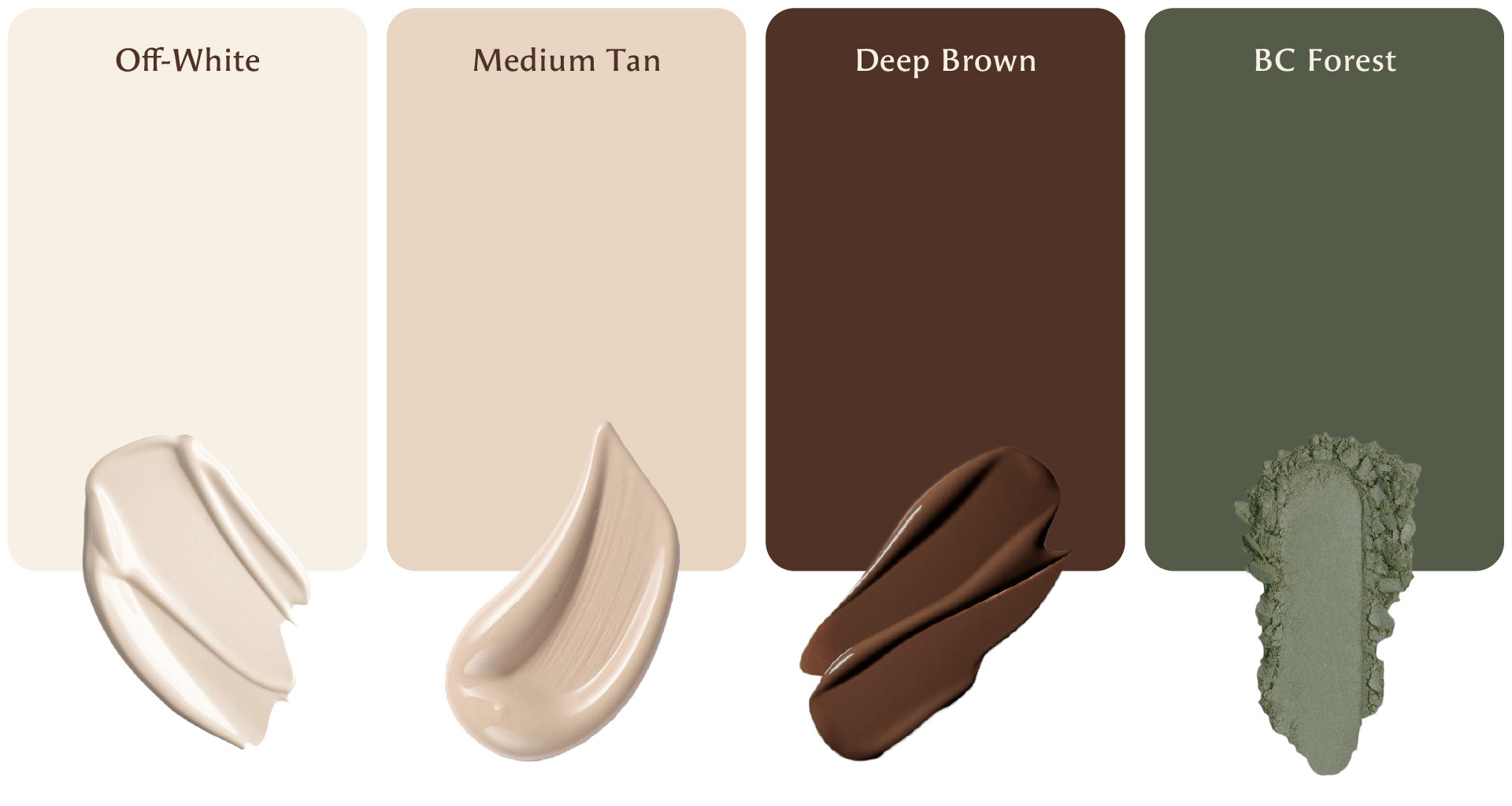
Colour Palette
A warm neutral palette and PNW green tie the identity together through colour.